Survival analysis is a statistical technique for determining the likelihood of events to happen over a timeline. It was originally based heavily in the medical/actuarial profession, where it would answer questions like: given this set of conditions, how likely is a person to survive X years? In previous posts, we’ve seen that we can tap into a huge amount of data in git repositories with git-pandas. In this post, we will try to derive a measure of relative code quality in a large open source project amongst committers.
To do this, we will use survival analysis, notably Cam Davidson Pilon’s lifelines library, to examine the likelihood for a developers code to survive. First, we must figure out what ‘survive’ means in this context.
With git data it is often much much simpler to do analysis at the file or module level rather than by single lines of code. In this case, we will look at just files. Any given file at any given point in time is considered to have an owner who is responsible for the majority of the code in that file.
We expect regular small updates to the file, but occasionally a large edit, addition, deletion or refactor occurs. We consider this event to be a ‘death’ in the context of survival analysis. So pretty quickly, with git-pandas and lifelines, we can generate a dataset given a rule for determining a refactor, then use the Kaplan-Meier estimator to generate a survival plot for those contributors with enough data to do so.
This isn’t perfect, not all files really have ‘owners’ and not all major changes are really ‘refactors’, but it’s an interesting start. So let’s try an example.
Big Additions
In this case we use the popular scikit-learn repository.
Our rule for refactor in this case is any single commit in which the file has a net line growth of over 100 lines. The code to generate the dataset and plot is pretty simple:
from gitpandas import Repository
import numpy as np
import lifelines
import matplotlib.pyplot as plt

threshold = 100
repo = Repository(working_dir='git://github.com/scikit-learn/scikit-learn.git', verbose=True)
fch = repo.file_change_history(limit=100000, extensions=['py', 'pyx', 'h', 'c', 'cpp'])

fch['file_owner'] = ''
fch['refactor'] = 0
fch['timestamp'] = fch.index.astype(np.int64) // (24 * 3600 * 10**9)
fch['observed'] = False
fch = fch.reindex()
fch = fch.reset_index()

# add in the file owner and whether or not each item is a refactor
for idx, row in fch.iterrows():
    fch.set_value(idx, 'file_owner', repo.file_owner(row.rev, row.filename, committer=True))
    if abs(row.insertions - row.deletions) > threshold:
        fch.set_value(idx, 'refactor', 1)
    else:
        fch.set_value(idx, 'refactor', 0)

# add in the time since column
fch['time_until_refactor'] = 0
for idx, row in fch.iterrows():
    ts = None
    chunk = fch[(fch['timestamp'] > row.timestamp) & (fch['refactor'] == 1) & (fch['filename'] == row.filename)]
    if chunk.shape[0] > 0:
        ts = chunk['timestamp'].min()
        fch.set_value(idx, 'observed', True)
    else:
        ts = fch['timestamp'].max()
    fch.set_value(idx, 'time_until_refactor', ts - row.timestamp)

# plot out some survival curves
fig = plt.figure()
ax = plt.subplot(111)
for filename in set(fch['file_owner'].values):
    sample = fch[fch['file_owner'] == filename]
    if sample.shape[0] > 20:
        print('Evaluating %s' % (filename, ))
        kmf = lifelines.KaplanMeierFitter()
        kmf.fit(sample['time_until_refactor'].values, event_observed=sample['observed'], timeline=list(range(365)), label=filename)
        ax = kmf.survival_function_.plot(ax=ax)

plt.title('Survival function of file owners (thres=%s)' % (threshold, ))
plt.xlabel('Lifetime (days)')
plt.show()
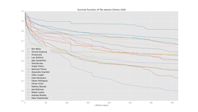
This will yield the plot:

Which looks pretty. You can see there is some kind of decay over time, with most owner’s pages going without refactor (by this measure) for many months, and a clear distinction between owners by the end of the plot (1 year).
Big Deletions
As a second example, let’s look at the exact same repo, same problem, but change the rule for determining refactor to be any time there is a net deletion of more than 100 lines. To do this, we just edit the code above and set threshold equal to -100. This yields the plot:

Interestingly, owner’s seem to not least nearly as long for deletions, with all dropping below 10% likelihood of survival (going without refactor) after a few months. This is a pretty stark contrast to the previous definition of refactor, which really drives home the point that the definition of what a refactor looks like really drives the end result here.
So my first two stabs at it are interesting, but they probably aren’t great representations. The code to produce this all is here, so try your own metrics and let me know what works or doesn’t. If we can find something that works well in the general case, I’ll add it into the core library of:
https://github.com/wdm0006/git-pandas
The post Using survival analysis and git-pandas to estimate code quality appeared first on Will’s Noise.