by Geir Freysson | March 21, 2017
About Geir: Geir is the co-founder and CEO of Datasmoothie, a tech company that brings the joy back into statistical analysis. Geir is also a caffeine enthusiast and Internet addict.
Introduction
How is the President doing in the latest polls? Are your employees happy? Is this medicine working? Do people think machines will replace humans in the next 50 years?
Quantipy is an open source Python library developed in collaboration between the opinion polling company YouGov and us, Datasmoothie. Quantipy focuses on making life easier for researchers in the people data industry who work on gathering answers to questions like the ones above.
In this blog post we are going to show you how to take raw survey data and automatically generate a PowerPoint slideshow, which can be themed according to your brand. You’ll end up with 28 automatically generated slides that show people’s opinions on various questions on machine automation, as surveyed by PEW Research centre.
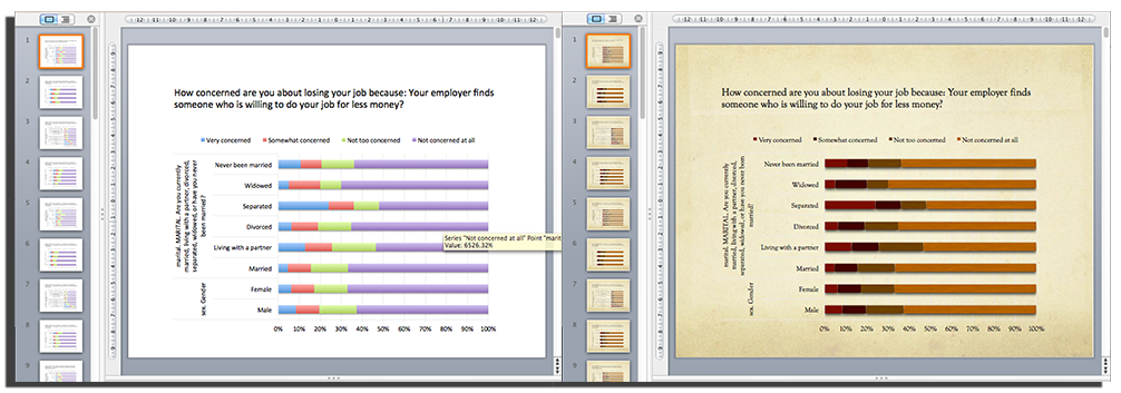
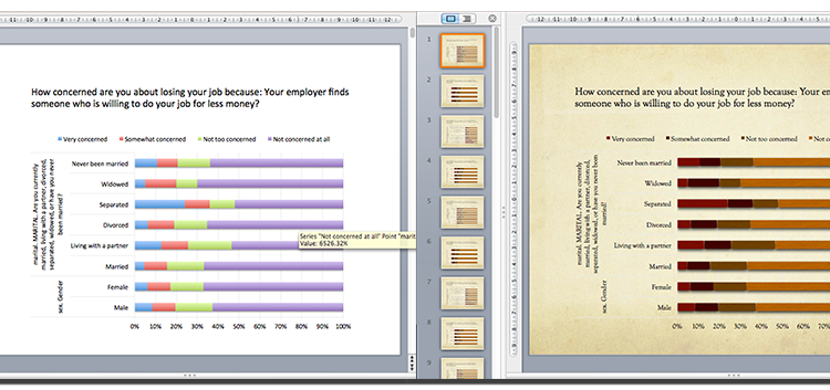
Quantipy creates slides that use native PowerPoint/Excel charts so they can be branded with different PowerPoint themes. On the left is a basic chart and on the right the user has chosen one of the standard PowerPoint themes.
Reading survey data into python with Quantipy
We start by reading the data into Quantipy, straight from SPSS (a common file-type in the people data industries).
dataset = qp.DataSet(‘pew-dataset’)
dataset.read_spss(‘./gaming-jobs-broadband.sav’)
We start by exploring what variables are in the dataset.
dataset.list_variables()
['sex','marital','ideo','q1,'q2', ...]
and we can have a look at the meta data to see what answers were available for specific questions (variables) as well.
dataset.describe(‘marital’)
single                                      codes texts
marital: MARITAL. Are you currently married ...
1                                           1 Married
2                                           2 Living with a partner
3                                           3 Divorced
4                                           4 Separated
5                                           5 Widowed
6                                           6 Never been married
7                                           8 Don’t know
8                                           9 Refused None
Decide what questions and answers to include
Once we’ve decided what variables we want in our PowerPoint presentation we add them to the appropriate arrays. We are going to build a slide deck that shows answers to questions on machine automation and we are going to analyse how people of different genders, with different levels of education, different marital statuses and in different regions responded.
#these are the questions
xvars =[‘auto1a’,’auto1b’,’auto1c’,
        ’auto1d’,’auto1e’,’auto2',’auto3']
#and these are the groups we are comparing to
yvars = [‘sex’,’ideo’,’cregion’,’educ2',’marital’]
Data aggregation
We then create a so-called Quantipy Stack which stores all of our aggregations and also gives us access to pulling them out in convenient ways.
stack = qp.Stack(add_data={'pew': {'data': dataset.data(),
                                   'meta': dataset.meta()}})

#this is where the aggregations happen
stack.add_link(x=xvars,y=yvars,views=['cbase','c%'])
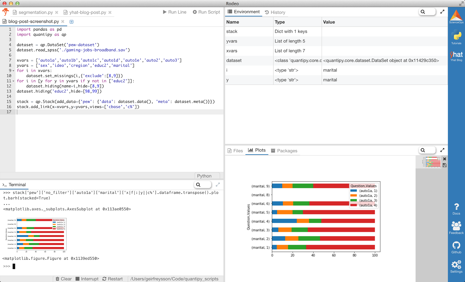
We can explore the stack directly, for a sanity check. We use a Python IDE specifically designed for data-science made by Yhat, called Rodeo, and in it we use the console to plot the result of how people answered the variable “auto1a” according to their marital status. Don’t worry about how the chart looks for now.
stack[‘pew’][‘no_filter’][‘auto1a’][‘marital’][‘x|f|:|y||c%’].dataframe.transpose().plot.barh(stacked=True)
Export to PowerPoint
Now that we’ve aggregated our results we want to present them in PowerPoint. We use the python-pptx library to generate our PowerPoint files and some handy Quantipy helper methods to create slides from pandas dataframes. We’re also ready for the data to be consumer friendly, so we replace codes with actual labels with paint_dataframe.
from pptx import Presentation
import quantipy.core.builds.powerpoint.helpers as hp
from quantipy.core.helpers.functions import paint_dataframe
prs = Presentation()
# we want to group some background varialbes onto the same slide,
# e.g. gender and marital status
slide_vars = [[‘sex’,’marital’],[‘cregion’],[‘educ2’],[‘ideo’]]
for question in xvars:
    for slide in slide_vars:
        chains = stack.get_chain(x=question,y=slide,views=
                           [‘x|f|:|y||c%’],orient_on=’x’,rules=True)
        df = paint_dataframe(dataset.meta(),
                             chains[0].concat().transpose())
        chartData = hp.ChartData_from_DataFrame(df)
        question_label = df.columns.levels[0][0]
        hp.add_slide_with_chart(prs, chartData,
                                question_label,legend=True,
                                normalized=True)
prs.save(‘my-report.pptx’)
That’s all there is to it. You now have a PowerPoint Document with 28 slides, seven questions compared across five background variables. Because the charts are exported to native PowerPoint/Excel charts they respond to changes in the theme, so the slides can be branded according to your theme with the click of a mouse.
You can also export directly to an online dashboard or report with Datasmoothie (like this one), which will be covered in another post.