Visualizing data is vital to analyzing data. If you can’t see your data – and see it in multiple ways – you’ll have a hard time analyzing that data. There are quite a few ways to visualize data and, thankfully, with pandas, matplotlib and/or seaborn, you can make some pretty powerful visualizations during analysis.
One of the things I like to do when I get a new dataset is try to visualize data points against each other to see if there’s anything that jumps out at me. To do this, I like to overlay charts against each other to find any patterns in the data / charts. With matplotlib, this is pretty easy to do but working with dual-axis can be a bit confusing at first.
Want to learn more about data visualization and/or matplotlib? Here are a few books / websites with good info on the topic.
- Data Visualization with Python and JavaScript: Scrape, Clean, Explore & Transform Your Data
- Mastering matplotlib
- Matplotlib tutorial
- How to make beautiful data visualizations in Python with matplotlib
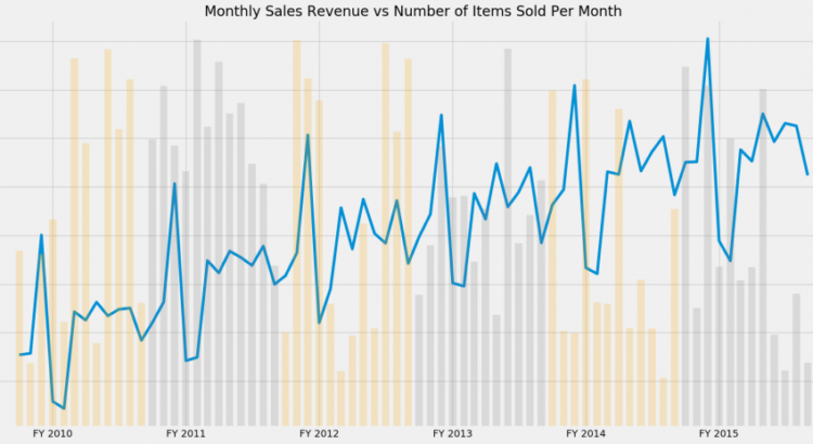
One chart that I like to look at for data that I know has a relationship – like sales revenue and number of widgets sold – is the dual overlay of revenue vs quantity. An example of one of my go-to approaches for visualizing data is in Figure 1 below.
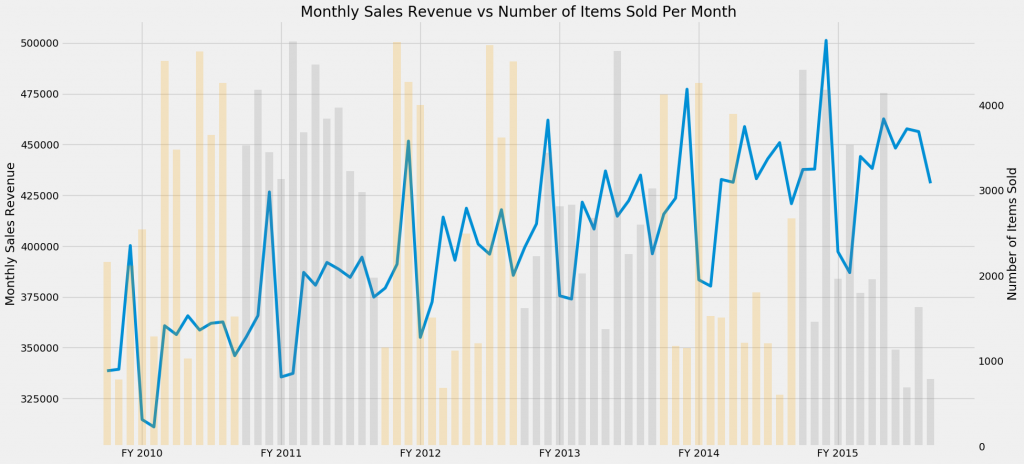
In this chart, we have Monthly Sales Revenue (blue line) chart overlay-ed against the Number of Items Sold chart (multi-colored bar chart). This type of chart lets me quickly see if there are any easy patterns in the revenue vs # of items.
I’ve not found a quick/easy way to build the multi-colored bar chart without hacking the data and building each colored section manually…so if you know a better way that what I share below, let me know.
An example
Here’s my code for building this chart using this data.
import numpy as np
import pandas as pd
import matplotlib.pyplot as plt

%matplotlib inline # needed for jupyter notebooks

plt.rcParams['figure.figsize']=(20,10) # set the figure size
plt.style.use('fivethirtyeight') # using the fivethirtyeight matplotlib theme

sales = pd.read_csv('examples/sales.csv') # Read the data in
sales.Date = pd.to_datetime(sales.Date) #set the date column to datetime
sales.set_index('Date', inplace=True) #set the index to the date column

# now the hack for the multi-colored bar chart:
# create fiscal year dataframes covering the timeframes you are looking for. In this case,
# the fiscal year covered October - September.
# --------------------------------------------------------------------------------
# Note: This should be set up as a function, but for this small amount of data,
# I just manually built each fiscal year. This is not very pythonic and would
# suck to do if you have many years of data, but it isn't bad for a few years of data.
# --------------------------------------------------------------------------------

fy10_all = sales[(sales.index >= '2009-10-01') & (sales.index < '2010-10-01')]
fy11_all = sales[(sales.index >= '2010-10-01') & (sales.index < '2011-10-01')]
fy12_all = sales[(sales.index >= '2011-10-01') & (sales.index < '2012-10-01')]
fy13_all = sales[(sales.index >= '2012-10-01') & (sales.index < '2013-10-01')]
fy14_all = sales[(sales.index >= '2013-10-01') & (sales.index < '2014-10-01')]
fy15_all = sales[(sales.index >= '2014-10-01') & (sales.index < '2015-10-01')]

# Let's build our plot

fig, ax1 = plt.subplots()
ax2 = ax1.twinx()  # set up the 2nd axis
ax1.plot(sales.Sales_Dollars) #plot the Revenue on axis #1

# the next few lines plot the fiscal year data as bar plots and changes the color for each.
ax2.bar(fy10_all.index, fy10_all.Quantity,width=20, alpha=0.2, color='orange')
ax2.bar(fy11_all.index, fy11_all.Quantity,width=20, alpha=0.2, color='gray')
ax2.bar(fy12_all.index, fy12_all.Quantity,width=20, alpha=0.2, color='orange')
ax2.bar(fy13_all.index, fy13_all.Quantity,width=20, alpha=0.2, color='gray')
ax2.bar(fy14_all.index, fy14_all.Quantity,width=20, alpha=0.2, color='orange')
ax2.bar(fy15_all.index, fy15_all.Quantity,width=20, alpha=0.2, color='gray')

ax2.grid(b=False) # turn off grid #2

ax1.set_title('Monthly Sales Revenue vs Number of Items Sold Per Month')
ax1.set_ylabel('Monthly Sales Revenue')
ax2.set_ylabel('Number of Items Sold')

# Set the x-axis labels to be more meaningful than just some random dates.
labels = ['FY 2010', 'FY 2011','FY 2012', 'FY 2013','FY 2014', 'FY 2015']
ax1.axes.set_xticklabels(labels)
This is just one way of visualizing data with python. Hopefully its a good example of a different approach that you may not have thought about.
The post Visualizing data – overlaying charts in python appeared first on Python Data.