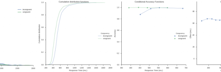
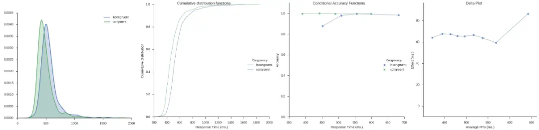
Inspired by my post for the JEPS Bulletin (Python programming in Psychology), where I try to show how Python can be used from collecting to analyzing and visualizing data, I have started to learn more data exploring techniques for Psychology experiments (e.g., response time and accuracy). Here are some methods, using Python, for visualization of distributed data that I have learned; kernel density estimation, cumulative distribution functions, delta plots, and conditional accuracy functions. These graphing methods let you explore your data in a way just looking at averages will not (e.g., Balota & Yap, 2011).
Required Python packages
I used the following Python packages; Pandas for data storing/manipulation, NumPy for some calculations, Seaborn for most of the plotting, and Matplotlib for some tweaking of the plots. Any script using these functions should import them:
from __future__ import division
import pandas as pd
import numpy as np
import matplotlib.pyplot as plt
import seaborn as sns
Kernel Density Estimation
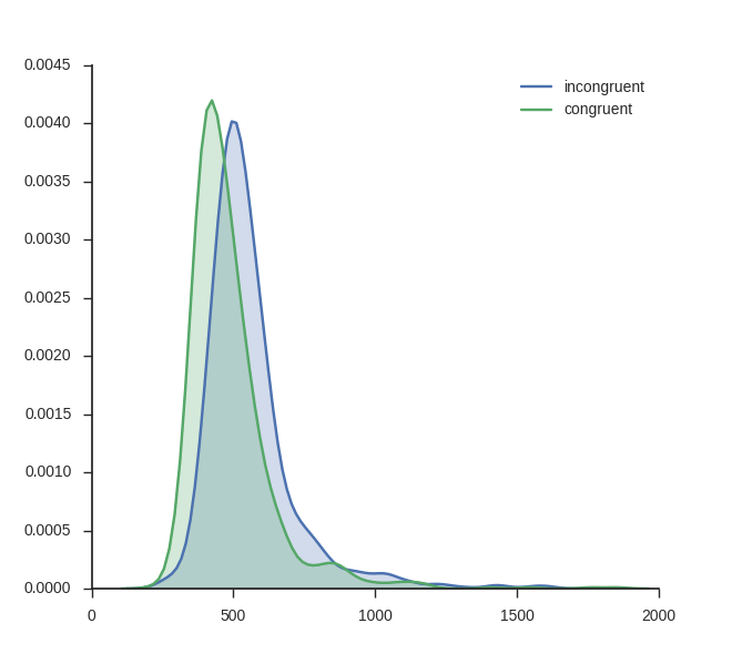
The first plot is the easiest to create using Python; visualizing the kernel density estimation. It can be done using the Seaborn package only. kde_plot takes the arguments df Note, in the beginning of the function I set the style to white and to ticks. I do this because I want a white background and ticks on the axes.
def kde_plot(df, conditions, dv, col_name, save_file=False):
    sns.set_style('white')
    sns.set_style('ticks')
    fig, ax = plt.subplots()

    for condition in conditions:
        condition_data = df[(df[col_name] == condition)][dv]
        sns.kdeplot(condition_data, shade=True, label=condition)

    sns.despine()

    if save_file:
        plt.savefig("kernel_density_estimate_seaborn_python_response"
                     "-time.png")
    plt.show()
Using the function above you can basically plot as many conditions as you like (however, but with to many conditions, the plot will probably be cluttered). I use some response time data from a Flanker task:
# Load the data
frame = pd.read_csv('flanks.csv', sep=',')
kde_plot(frame, ['incongruent', 'congruent'], 'RT', 'TrialType',
         save_file=False)
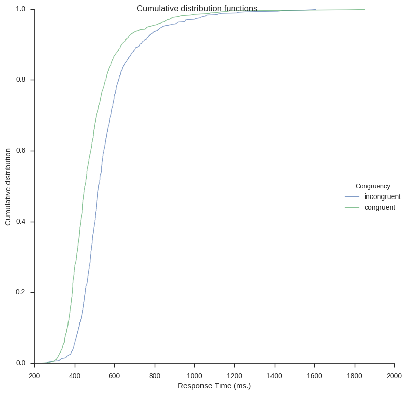
Cumulative Distribution Functions
Next out is to plot the cumulative distribution functions (CDF). In the first function CDFs for each condition will be calculated. It takes the arguments df (a Pandas dataframe), a list of the conditions (i.e., conditions).
def cdf(df, conditions=['congruent', 'incongruent']):

    data = {i: df[(df.TrialType == conditions[i])] for i in range(len(
        conditions))}
    plot_data = []

    for i, condition in enumerate(conditions):

        rt = data[i].RT.sort_values()
        yvals = np.arange(len(rt)) / float(len(rt))

        # Append it to the data
        cond = [condition]*len(yvals)

        df = pd.DataFrame(dict(dens=yvals, dv=rt, condition=cond))
        plot_data.append(df)

    plot_data = pd.concat(plot_data, axis=0)

    return plot_data
Next is the plot function (cdf_plot). The function takes a Pandas a dataframe (created with the function above) as argument as well as save_file and legend.
def cdf_plot(cdf_data, save_file=False, legend=True):
    sns.set_style('white')
    sns.set_style('ticks')
    g = sns.FacetGrid(cdf_data, hue="condition", size=8)
    g.map(plt.plot, "dv", "dens", alpha=.7, linewidth=1)
    if legend:
        g.add_legend(title="Congruency")
    g.set_axis_labels("Response Time (ms.)", "Probability")
    g.fig.suptitle('Cumulative density functions')

    if save_file:
        g.savefig("cumulative_density_functions_seaborn_python_response"
                  "-time.png")

    plt.show()
Here is how to create the plot on the same Flanker task data as above:
cdf_dat = cdf(frame, conditions=['incongruent', 'congruent'])
cdf_plot(cdf_dat, legend=True, save_file=False)
Delta Plots
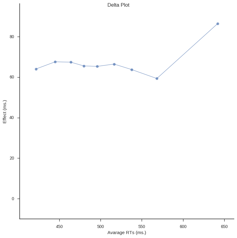
In Psychological research Delta plots (DPs) can be used to visualize and compare response time (RT) quantiles obtained under two experimental conditions. DPs enable examination whether the experimental manipulation has a larger effect on the relatively fast responses or on the relatively slow ones (e.g., Speckman, Rouder, Morey, & Pratte, 2008).
In the following script I have created two functions; calc_delta_data and delta_plot. calc_delta_data takes a Pandas dataframe (df). Rest of the arguments you need to fill in the column names for the subject id, the dependent variable (e.g., RT), and the conditions column name. All in the string data type. The last argument should contain a list of strings of the factors in your condition.
def calc_delta_data(df, subid, dv, condition, conditions=['incongruent',
                                                   'congruent']):

    subjects = pd.Series(df[subid].values.ravel()).unique().tolist()
    subjects.sort()

    deciles = np.arange(0.1, 1., 0.1)

    cond_one = conditions[0]
    cond_two = conditions[1]

    # Frame to store the data (per subject)
    arrays = [np.array([cond_one, cond_two]).repeat(len(deciles)),
              np.array(deciles).tolist() * 2]
    data_delta = pd.DataFrame(columns=n_subjects, index=arrays)

    for subject in subjects:

        sub_data_inc = df.loc[(df[subid] == subject) & (df[condition] ==
                                                        cond_one)]
        sub_data_con = df.loc[(df[subid] == subject) & (df[condition] ==
                                                        cond_two)]

        inc_q = sub_data_inc[rt].quantile(q=deciles).values
        con_q = sub_data_con[rt].quantile(q=deciles).values
        for i, dec in enumerate(deciles):
            data_delta.loc[(cond_one, dec)][subject] = inc_q[i]
            data_delta.loc[(cond_two, dec)][subject] = con_q[i]


    # Aggregate deciles
    data_delta = data_delta.mean(axis=1).unstack(level=0)
    # Calculate difference
    data_delta['Diff'] = data_delta[cond_one] - data_delta[cond_two]
    # Calculate average
    data_delta['Average'] = (data_delta[cond_one] + data_delta[cond_two]) / 2

    return data_delta
Next function, delta_plot, takes the data returned from the calc_delta_data function to create a line graph.
def delta_plot(delta_data, save_file=False):

    ymax = delta_data['Diff'].max() + 10
    ymin = -10
    xmin = delta_data['Average'].min() - 20
    xmax = delta_data['Average'].max() + 20

    sns.set_style('white')
    g = sns.FacetGrid(delta_data, ylim=(ymin, ymax), xlim=(xmin, xmax), size=8)
    g.map(plt.scatter, "Average", "Diff", s=50, alpha=.7, linewidth=1,
          edgecolor="white")
    g.map(plt.plot, "Average", "Diff", alpha=.7, linewidth=1)
    g.set_axis_labels("Avarage RTs (ms.)", "Effect (ms.)")
    g.fig.suptitle('Delta Plot')
    if save_file:
        g.savefig("delta_plot_seaborn_python_response-time.png")

    plt.show()

    sns.plt.show()
The above functions are quite easy to use. First load your data (again, I use data from a Flanker task).
# Load the data
frame = pd.read_csv('flanks.csv', sep=',')
# Calculate delta plot data and plot it
d_data = calc_delta_data(frame, "SubID", "RT", "TrialType", ['incongruent',
                                                        'congruent'])
delta_plot(d_data)
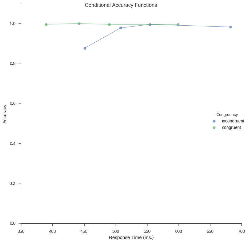
Conditional Accuracy Functions
Conditional accuracy functions (CAF) is a technique that also incorporates the accuracy in the task. Creating CAFs involve binning your data (e.g., the response time and accuracy) and creating a linegraph. Briefly, CAFs can capture patterns related to speed/accuracy trade-offs. First function,
def calc_caf(df, subid, rt, acc, trialtype, quantiles=[0.25, 0.50, 0.75, 1]):


    # Subjects
    subjects = pd.Series(df[subid].values.ravel()).unique().tolist()
    subjects.sort()

    # Multi-index frame for data:
    arrays = [np.array(['rt'] * len(quantiles) + ['acc'] * len(quantiles)),
              np.array(quantiles * 2)]

    data_caf = pd.DataFrame(columns=subjects, index=arrays)

    # Calculate CAF for each subject
    for subject in subjects:

        sub_data = df.loc[(df[subid] == subject)]

        subject_cdf = sub_data[rt].quantile(q=quantiles).values

        # calculate mean response time and proportion of error for each bin
        for i, q in enumerate(subject_cdf):

            quantile = quantiles[i]

            # First
            if i < 1:
                # Subset
                temp_df = sub_data[(sub_data[rt] < subject_cdf[i])]
                # RT
                data_caf.loc[('rt', quantile)][subject] = temp_df[rt].mean()
                # Accuracy
                data_caf.loc[('acc', quantile)][subject] = temp_df[acc].mean()

            # Second  & third (if using 4)
            elif i == 1 or i < len(quantiles):

                # Subset
                temp_df = sub_data[(sub_data[rt] > subject_cdf[i - 1]) & (
                    sub_data[rt] < q)]
                # RT
                data_caf.loc[('rt', quantile)][subject] = temp_df[rt].mean()

                # Accuracy
                data_caf.loc[('acc', quantile)][subject] = temp_df[acc].mean()

           # Last
           elif i == len(quantiles):

                # Subset
                temp_df = sub_data[(sub_data[rt] > subject_cdf[i])]

                # RT
                data_caf.loc[('rt', quantile)][subject] = temp_df[rt].mean()

                # Accuracy
                data_caf.loc[('acc', quantile)][subject] = temp_df[acc].mean()

    # Aggregate subjects CAFs
    data_caf = data_caf.mean(axis=1).unstack(level=0)

    # Add trialtype
    data_caf['trialtype'] = [condition for _ in range(len(quantiles))]

    return data_caf
caf_plot (the function below) uses Seaborn, again, to plot the conditional accuracy functions.
def caf_plot(df, legend_title='Congruency', save_file=True):
    sns.set_style('white')
    sns.set_style('ticks')
    g = sns.FacetGrid(df, hue="trialtype", size=8, ylim=(0, 1.1))
    g.map(plt.scatter, "rt", "acc", s=50, alpha=.7, linewidth=1,
          edgecolor="white")
    g.map(plt.plot, "rt", "acc", alpha=.7, linewidth=1)
    g.add_legend(title=legend_title)
    g.set_axis_labels("Response Time (ms.)", "Accuracy")
    g.fig.suptitle('Conditional Accuracy Functions')

    if save_file:
        g.savefig("conditional_accuracy_function_seaborn_python_response"
                   "-time.png")

    plt.show()
Right now, the function for calculation the Conditional Accuracy Functions can only do one condition at the time. Thus, in the code below I subset the Pandas dataframe (same old, Flanker data as in the previous examples) for incongruent and congruent conditions. The CAFs for these two subsets are then concatenated (i.e., combined to one dataframe) and plotted.
# Conditional accuracy function (data) for incongruent and congruent conditions
inc = calc_caf(frame[(frame.TrialType == "incongruent")], "SubID", "RT", "ACC",
               "incongruent")
con = calc_caf(frame[(frame.TrialType == "congruent")], "SubID", "RT", "ACC",
               "congruent")

# Combine the data and plot it
df_caf = pd.concat([inc, con])

caf_plot(df_caf, save_file=True)
Update: I created a Jupyter notebook containing all code: Exploring distributions.
References
Balota, D. a., & Yap, M. J. (2011). Moving Beyond the Mean in Studies of Mental Chronometry: The Power of Response Time Distributional Analyses. Current Directions in Psychological Science, 20(3), 160–166. http://doi.org/10.1177/0963721411408885
Speckman, P. L., Rouder, J. N., Morey, R. D., & Pratte, M. S. (2008). Delta Plots and Coherent Distribution Ordering. The American Statistician, 62(3), 262–266. http://doi.org/10.1198/000313008X333493
The post Exploring response time distributions using Python appeared first on Erik Marsja.