I first posted in this blog 14 months ago. In the history of humanity, that’s
not all that long ago, but for me it feels like an age. When I wrote that
original blog post, I was still at university (just). I knew I was going to be
a software engineer, but didn’t have much experience. In particular, I knew
absolutely nothing about web development.
The original design was nothing to write home about. It was fairly plain,
black-and-white, using a fairly standard set of fonts. This was largely a
deliberate decision: back then I knew literally nothing about design.
Essentially all I knew is that I couldn’t get anything to look the way I wanted
it to, so I should do as little as possible.
Over the past year-and-a-bit I’ve extended the design. Just small things,
largely stolen from smarter people than myself. I added some horizontal rules,
and a few splashes of colour. I spent an evening designing a
(less-than-impressive) SVG logo so that the word ‘Lukasa’ wouldn’t be
literally everywhere on the page.
Slowly and inevitably, however, I grew tired of the design. Small things came
to annoy me. Things like the inconsistent spacing, and the bizarre double-rule
at the bottom of most pages that I couldn’t easily get rid of, and the totally
boring font choices. It occurred to me I could do better. So over the last few
weeks I’ve been quietly working on a new design: the one you’re looking at now.
I want to take some time to talk over some of the changes I made and some of
the tech I’m using. I promise, I’ll go back to HTTP for my next post.
The Old
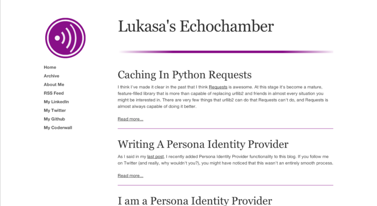
Let’s begin by looking at what I used to have. For those of you who don’t
remember, this is what the front page used to look like:


There is nothing inherently bad about the design of that page. It looks fine,
especially considering the guy who built it didn’t know anything about web
design. But looking at it now, there are some things that drive me crazy about
it. Little things, really, but here’s a list of them:
- The body font is just slightly too small (14px).
- The spacing is inconsistent. Look at the spacing around the horizontal rules
in particular. - The horizontal rules aren’t consistent. Either they should all fade or none
should, not this weird half-assed thing. - There is a poor use of width. This was an attempt to make the site responsive
by simply refusing to get wider than a certain point, instead putting
massive white margins at the side. Not great. - The top header is left-aligned, which is just weird.
- There’s two horizontal rules at the bottom of the page. Why? Because I
sucked at code, that’s why. - While we’re at the bottom of the page, the copyright license at the bottom
is left-aligned for no good reason. - The design is heavy. The biggest problem here is that the headers are just
way too heavy, which totally undermines the otherwise good use of empty
space.
The other page that really drove me nuts was the old ‘About Me’ page. For a
page that was supposed to sell me, it did a truly lousy job. Take a look:

The text was short and didn’t really say anything about me. Let’s not even get
started on the weirdly pretentious idea I had to place a quote beside the body
text. I think I just liked the way it looked. Don’t get me wrong, Neil Gaiman
is a genius and The Sandman is a great work of modern fiction (go read it). But
it looks really out of place there.
The final problem is the tech. I was using the
Skeleton CSS framework (see how much of my
design I ‘borrowed’ from there?). The problem is that Skeleton is essentially
dead and has been for a year. That doesn’t exactly inspire confidence. So it
was time to move to something newer. And shinier.
The New
So what did I want from the new design? Minimalism is still the way I wanted to
go, because it’s the saving grace of bad designers (like myself). Great
designers can do great work using minimalism, but lesser designers can avoid
shooting themselves in the foot. That’s awesome for me. So minimal and
nearly-flat was the way I decided to go.
I also wanted a CSS framework (though I ended up using very little of it, and
could probably have avoided it altogether). Because I really didn’t need much,
I decided to go for small. For that reason, I chose Pure.
The first question was the colour scheme. Fitting with minimalism, I wanted
predominantly greyscale, but with an accent colour I could use to highlight
things. Given the colour used in my logo, there was only one choice: the colour
I’m now calling ‘Lukasa Purple’ (#870e87, if you’re interested). And it would
be used sparingly: in the end, only on the header and the sidebar links (to
suggest ‘clickability’). Finding a sidebar grey that worked with the purple was
a bit of work (big thanks to Andrey Petrov for tips with
that), but in the end I managed to find one I liked.
Next, fonts. I used Google Web Fonts, and basically searched for a sans-serif
that looked good large and at light font weights. I ended up choosing Titillium
Web, which now adorns the headers of my page, looking all sharp, modern and
graceful.
Then I tore everything out. Everything that was in the sidebar came out and I
carefully tried to justify their existence. In the end all the social stuff was
removed entirely (you can still find it on the ‘About Me’) page. On the other
hand, the stuff I liked was accentuated. In particular, the SVG logo became
way larger.
I removed the giant horizontal rule, and replaced the rules between posts with
smaller horizontal rules that attracted less attention to themselves. Their
purpose is not to make the page pretty, it’s to structure it, so they needed to
be less garish than the previous purple ones.
And all of a sudden I found I was nearly done. A few little bits and bobs, like
making the sidebar elements change colour when they get hovered over, and I
was left with what you see now.
Then I went in and rewrote the ‘About Me’ page. The biggest improvement on that
whole page isn’t the new design or the extra detail, it’s the tone. The main
header has changed from “About Me” to “Hi, I’m Cory”. That change in tone from
formal to conversational has an unexpectedly large effect on how the whole page
reads.
Summing Up
Altogether I’m happy with how things turned out. There is less CSS than there
was before, it’s better laid out, it looks cleaner and lighter and the font is
an intelligent size again. There are probably some gaps in the CSS, a few edge
cases I haven’t considered, so if you find one of them please let me know.
Otherwise, let me know what you think of the new design, and stay tuned,
because I’ll go back to my (semi-regular) normal blogging soon!