I haven’t written a post in a while. I had a lot to do for university and my hobbies like recreational programming and blogging have to suffer during those times. But now I have found some time and I’ll be adding smaller posts every now and then.
In the Machine Learning course I am taking at university I could use matplotlib to plot my functions for the homework submissions. So I have gotten more familiar with coding plots and graphs in Python since my last post about matplotlib. So I wanted to prepare some interactive plots for my blog and present to you what I have been able to create so far.
Web Scrapping for Dummies
First I wanted to find some interesting data to display. I decided to collect my own data as opposed to take an already publicly available data set, since this can easily be done in Python. For a step-by-step guide on how to scrap data from a web page, where the site is generated on the server side and you can find your data directly in the html code, I recommend chapter 11 in Automate the Boring Stuff in Python from Al Sweigart. The standard module for this type of web scraping is BeautifulSoup, which makes it easy for you to find certain tags in an HTML file.
So I decided, that I wanted to collect the stats of all currently active NBA players. Luckily, there is a blog post from Greg Reda that explained exactly how this can be done in Python. This approach of web scrapping is different, since a lot of newer sites create the web page on the client-side. So you have to find the url for the request to the server. The response you then get is often a JSON object, which you can then parse for the information you want.
The stats.nba.com web page is generated on the client-side, so the latter approach was necessary. I first collected the person_ids from every NBA player in the database and then checked their roster status, whether the player is still actively playing in the NBA or not (here is the url for the player list). This is how my code for this task looks like:
import requests
import csv
import sys

# get me all active players

url_allPlayers = ("http://stats.nba.com/stats/commonallplayers?IsOnlyCurrentSeason"
		"=0&LeagueID=00&Season=2015-16")

#request url and parse the JSON
response = requests.get(url_allPlayers)
response.raise_for_status()
players = response.json()['resultSets'][0]['rowSet']

# use rooster status flag to check if player is still actively playing
active_players = [players[i] for i in range(0,len(players)) if players[i][2]==1 ]

ids = [active_players[i][0] for i in range(0,len(active_players))]

print("Number of Active Players: " + str(len(ids)))
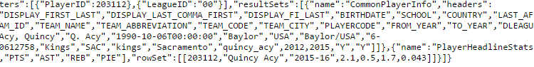
I can then use the IDs of the active players to open their own web page and use the request, that gives me more detailed stats like their point average in this season (2015/2016). I found the right request by following the approach explained in Gred Reda’s blog post. Here is the JSON object for the active NBA player Quincy Acy. When viewing these JSON object in your browser I suggest installing a plug-in like JSONView, since this allows a cleaner view at the content in the JSON object . This also has a great feature, where it shows in the bottom left of your browser screen how to access the current value your mouse is hovering over, which made writing the Python code much easier.

JSON object without JSONView
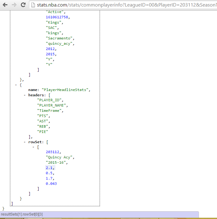
Same JSON object using JSONView in Chrome
I then loop over the collected IDs and scrapped together the individual data from the players. Here’s my code for this:
name_height_pos = []

for i in ids:

	url_onePlayer=("http://stats.nba.com/stats/commonplayerinfo?"
		"LeagueID=00&PlayerID=" + str(i) + "&SeasonType=Regular+Season")
	#request url and parse the JSON
	response = requests.get(url_onePlayer)
	response.raise_for_status()
	one_player = response.json()['resultSets'][0]['rowSet']
	stats_player = response.json()['resultSets'][1]['rowSet']

	try:
		points = stats_player[0][3]
		assists = stats_player[0][4]
		rebounds = stats_player[0][5]
		PIE = stats_player[0][6]
	# handle the case, where player is active, but didn't play
	# in any game so far in this season (-1 just a place holder value)
	except IndexError:
		points = -1
		assists = -1
		rebounds = -1
		PIE = -1

	name_height_pos.append([one_player[0][1] + " " + one_player[0][2],
		one_player[0][10],
		one_player[0][14],
		one_player[0][18],
		"http://i.cdn.turner.com/nba/nba/.element/img/2.0/sect/statscube/players/large/"+one_player[0][1].lower()+"_"+ one_player[0][2].lower() +".png",
		points,
		assists,
		rebounds,
		PIE])
In case you are wondering what PIE is, PIE (Player Impact Estimate) is an advanced statistic, that tries to describe a player’s contribution to the total statistics in an NBA game. PIE is calculated with a formula consisting out of simple player and game stats like points or team assists. If you are more interested in how PIE is calculated, go check the glossary of stats.nba.com. I decided to also collect this information too, since the JSON objects didn’t offer any other advanced statistic like the PER rating.
I also saved the link to the head shot of each player in case that could be useful for some kind of visualization. These links are all of a similar pattern, only the name of the player had to be inserted for the image file name. So this is how Quincy Acy looks like for everybody, who would like to know, and this is how Will Barton looks like.
In case you want to separate your visualization code in a separate Python script, then you should save the gathered info in some kind of table format like a csv file. Here’s a code snippet showing a easy way on how to save a list of lists in Python into a csv file:
with open("players.csv", "w") as csvfile:
	writer = csv.writer(csvfile, delimiter=",", lineterminator="n")
	writer.writerow(["Name","Height","Pos","Team","img_Link","PTS","AST","REB","PIE"])
	for row in name_height_pos:
		writer.writerow(row)
	print("Saved as 'players.csv'")
I have added the complete file I have used to scrap the NBA player data on GitHub for those, who want to try this out at home.
Here also a short preview on how the head of the csv file would then look like (I have left out the link name here, since that is just a long string of letters, that doesn’t contribute to the understanding the csv file structure at all):
 Name,Height,Pos,Team,img_Link,PTS,AST,REB,PIE
Quincy Acy,200.66,Forward,SAC,[link],2.3,0.5,1.8,0.046
Jordan Adams,195.58,Guard,MEM,[link],3.5,1.5,1.0,0.092
Steven Adams,213.36,Center,OKC,[link],6.0,0.8,5.8,0.074
Arron Afflalo,195.58,Guard,NYK,[link],12.6,1.7,3.8,0.077
⋮ , ⋮ , ⋮ , ⋮ , ⋮, ⋮ , ⋮ , ⋮ , ⋮
3D scatter plots in Plotly
I wanted to create some kind of visualization using three axes the describe the three most popular statistics recorded in a basketball game: points, assists and rebounds. Each plot point should represent one player and when hovering over a plot point it should at least show the player’s name and also the exact values for his average points, assists and rebounds scored per game, if it can’t easily be read from the graph, which can often be the case in 3D visualizations.
I decided to use Plotly to create my first 3D scatter plot. Plotly is a web program, that allows you to upload your collected data and to easily create plots and graphs, that you then easily can share or even embed into your website. Plotly allows you to create very specific visualizations and there are many variables that can be manipulated to create exactly the type of plot you want.
You have to sign up for in Plotly and create your own user account, but this is all free and it also offers a portfolio view for other users to look at the plots, tables and graphs you have created (here is my account page for example).
So this is the scatter plot I was able to create in a matter of minutes with the data I have collected:
Interactive scatter plots with MPLD3
While the first example with Plotly didn’t require much additional coding or any knowledge of matplotlib, you can also create interactive plots for the web using the matplotlib module in combination with MPLD3. MPLD3 can create a html file containing a converted version of your matplotlib graph into javascript code using D3JS. MPLD3 can’t convert everything that can be made with matplotlib, like 3D graphs for example, but its still a good solution if you want to keep some interactivity when presenting your matplotlib plots on the web.
I had some troubles with getting the MPLD3 module to work on Python 3.4, when using the release available from simply using pip to install the module. It worked, when I used pip to install the most recent release on GitHub (see my previous post on Legofy to see how this works), but there you also have to follow a few additional installation steps, but these are well explained on the README.md page.
So here is what a I created with matplotlib and the collected data. The code for this plot is given under the plot:
# some plots made with the mined nba data

import csv
import matplotlib.pyplot as plt
from matplotlib.font_manager import FontProperties
import mpld3

def main():
	with open("players_02.csv", "r") as nba_file:
			csv_reader = csv.reader(nba_file, delimiter=",")
			nba_list = list(csv_reader)[1:] # skip header description

	# header: Name,Height,Pos,Team,img_Link,PTS,AST,REB,PIE [Total: 9]

	# convert data into right data types (Height, PTS, AST, REB, PIE)
	for row in nba_list:
		row[1] = float(row[1])
		row[5] = float(row[5])
		row[6] = float(row[6])
		row[7] = float(row[7])
		row[8] = float(row[8])

	# remove all active players without any recorded stats

	nba_list = [player for player in nba_list if player[5] != -1]

	heights 	= [i[1] for i in nba_list]
	points 		= [i[5] for i in nba_list]
	assists 	= [i[6] for i in nba_list]
	rebounds 	= [i[7] for i in nba_list]
	pie_ratings = [i[8] for i in nba_list]

	fig, axarr = plt.subplots(3, sharex=True)

	axarr[0].set_title("NBA Player Stats", fontsize=20, color="blue")

	# points / assists
	scatter1 = axarr[0].scatter(points, assists)
	axarr[0].set_xlabel("Points", fontsize=16)
	axarr[0].set_ylabel("Assists", fontsize=16)
	axarr[0].set_ylim([0,15])
	axarr[0].grid(True)

	# points / rebounds
	scatter2 = axarr[1].scatter(points, rebounds)
	axarr[1].set_xlabel("Points", fontsize=16)
	axarr[1].set_ylabel("Rebounds", fontsize=16)
	axarr[1].set_ylim([0,16])
	axarr[1].grid(True)

	# points / pie_ratings
	scatter3 = axarr[2].scatter(points, pie_ratings)
	axarr[2].set_xlabel("Points", fontsize=16)
	axarr[2].set_ylabel("PIE Rating", fontsize=16)
	axarr[2].grid(True)

	plt.xlim(0,35)

	labels = [i[0] for i in nba_list]
	tooltip1 = mpld3.plugins.PointLabelTooltip(scatter1, labels=labels)
	tooltip2 = mpld3.plugins.PointLabelTooltip(scatter2, labels=labels)
	tooltip3 = mpld3.plugins.PointLabelTooltip(scatter3, labels=labels)
	mpld3.plugins.connect(fig, tooltip1)
	mpld3.plugins.connect(fig, tooltip2)
	mpld3.plugins.connect(fig, tooltip3)


	mpld3.save_html(fig, "test_web_plots.html")

	mpld3.show()

if __name__ == "__main__":
	main()
Matplotlib plots have the visuals of MATLAB plots out of the 90s and a lot of additional care is necessary to make these plots prettier. To make this easier for yourself I would suggest using Seaborn, that already applies some nice visual standards to your Matplotlib plots.
This turned out to be a longer post than expected, but I hope it brought some insight on how easily you can collect data using Python and how you can quickly create interesting plots without a lot of code.
Thank you for reading, have a nice Christmas Break!
The post Visualizing NBA Player Statistics appeared first on Rather Read.