In past posts, I’ve shown that it’s pretty easy to create organization wide punchcards with git-pandas. Today, I put together a little twist on that particular visualization, to split my projects into two cohorts: open and closed source. My work at Predikto is, as work tends to be, mostly closed source (though we try to contribute to projects when we can). The work I do outside of Predikto is, in general, open source.
So when do I work on each cohort most? With git-pandas it’s pretty straightforward to set this up:
from gitpandas import ProjectDirectory

def get_data():
    open_repos = ProjectDirectory(working_dir=[
        'repo_1',
        'repo_2',
        ...,
        'repo_n'
    ], verbose=True)

    closed_repos = ProjectDirectory(working_dir=[
         'repo_1',
         'repo_2',
         ...,
         'repo_n'
    ], verbose=True)

    by = None
    open_punchcard = open_repos.punchcard(branch='master', extensions=['py'], by=by, normalize=2500)
    closed_punchcard = closed_repos.punchcard(branch='master', extensions=['py'], by=by, normalize=2500)

    return open_punchcard, closed_punchcard
This will return two dataframes of punchcard data, each pre-normalized to be similar scales (the reality is my work contributions are orders of magnitude larger than side projects, but we don’t want that to distort the plot, to skip this, just set normalize to None).
To plot the two punchcards on top of each other, we cannibalize some of the helper code that ships with git-pandas:
import matplotlib.pyplot as plt
import matplotlib.style
matplotlib.style.use('ggplot')

def plot(op, cp, metric='lines'):
    # find how many plots we are making
    fig = plt.figure(figsize=(8, 3), facecolor='#ffffff')
    ax = fig.add_subplot('111', axisbg='#ffffff')
    fig.subplots_adjust(left=0.06, bottom=0.04, right=0.98, top=0.95)

    fig.text(0.40, 0.95, "Open Source", ha="center", va="bottom", size="large", color="red")
    fig.text(0.5, 0.95, "vs.", ha="center", va="bottom", size="large")
    fig.text(0.60, 0.95, "Closed Source", ha="center", va="bottom", size="large", color="blue")

    ax.set_frame_on(False)
    ax.scatter(op['hour_of_day'], op['day_of_week'], s=op[metric], c='red', edgecolor='red', alpha=0.4, label='Open Source')
    ax.scatter(cp['hour_of_day'], cp['day_of_week'], s=cp[metric], c='blue', edgecolor='blue', alpha=0.4, label='Closed Source')

    for line in ax.get_xticklines() + ax.get_yticklines():
        line.set_alpha(0.0)
    dist = -0.8

    ax.plot([dist, 23.5], [dist, dist], c='#555555')
    ax.plot([dist, dist], [dist, 6.4], c='#555555')
    ax.set_xlim(-1, 24)
    ax.set_ylim(-0.9, 6.9)
    ax.set_yticks(range(7))

    for tx in ax.set_yticklabels(['Mon', 'Tues', 'Wed', 'Thurs', 'Fri', 'Sat', 'Sun']):
        tx.set_color('#555555')
        tx.set_size('small')
    ax.set_xticks(range(24))

    for tx in ax.set_xticklabels(['%02d' % x for x in range(24)]):
        tx.set_color('#555555')
        tx.set_size('small')
    ax.set_aspect('equal')
    plt.show(block=True)
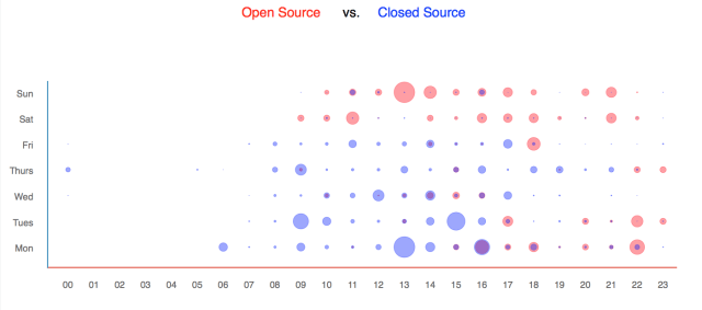
And that’s it, with a couple of commands you can get a nice little plot showing your general work-hours:
open_r, closed_r = get_data()
plot(open_r, closed_r)

Pretty easy. Try it out for yourself:
https://github.com/wdm0006/git-pandas
The post When do I work on what? appeared first on Will’s Noise.