
Diagnose Bias and Variance to Reduce Error
When building machine learning models, we want to keep error as low as possible. Two major sources of error are bias and variance. If we managed to reduce these two, then we could build more accurate models.
But how do we diagnose bias and variance in the first place? And what actions should we take once we’ve detected something?
In this post, we’ll learn how to answer both these questions using learning curves. We’ll work with a real world data set and try to predict the electrical energy output of a power plant.

Some familiarity with scikit-learn and machine learning theory is assumed. If you don’t frown when I say cross-validation or supervised learning, then you’re good to go. If you’re new to machine learning and have never tried scikit, a good place to start is this blog post.
We begin with a brief introduction to bias and variance.
The bias-variance trade-off
In supervised learning, we assume there’s a real relationship between feature(s) and target and estimate this unknown relationship with a model. Provided the assumption is true, there really is a model, which we’ll call $f$, which describes perfectly the relationship between features and target.
In practice, $f$ is almost always completely unknown, and we try to estimate it with a model $hat{f}$ (notice the slight difference in notation between $f$ and $hat{f}$). We use a certain training set and get a certain $hat{f}$. If we use a different training set, we are very likely to get a different $hat{f}$. As we keep changing training sets, we get different outputs for $hat{f}$. The amount by which $hat{f}$ varies as we change training sets is called variance.
To estimate the true $f$, we use different methods, like linear regression or random forests. Linear regression, for instance, assumes linearity between features and target. For most real-life scenarios, however, the true relationship between features and target is complicated and far from linear. Simplifying assumptions give bias to a model. The more erroneous the assumptions with respect to the true relationship, the higher the bias, and vice-versa.
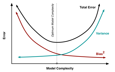
Generally, a model $hat{f}$ will have some error when tested on some test data. It can be shown mathematically that both bias and variance can only add to a model’s error. We want a low error, so we need to keep both bias and variance at their minimum. However, that’s not quite possible. There’s a trade-off between bias and variance.
A low-biased method fits training data very well. If we change training sets, we’ll get significantly different models $hat{f}$.
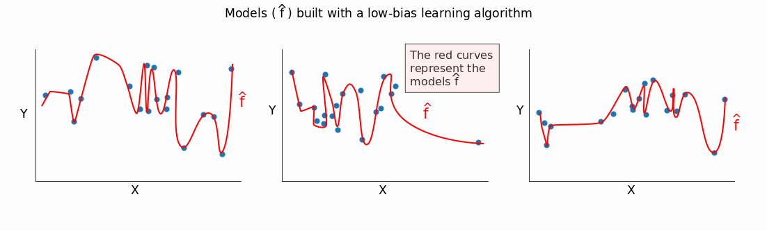
You can see that a low-biased method captures most of the differences (even the minor ones) between the different training sets. $hat{f}$ varies a lot as we change training sets, and this indicates high variance.
The less biased a method, the greater its ability to fit data well. The greater this ability, the higher the variance. Hence, the lower the bias, the greater the variance.
The reverse also holds: the greater the bias, the lower the variance. A high-bias method builds simplistic models that generally don’t fit well training data. As we change training sets, the models $hat{f}$ we get from a high-bias algorithm are, generally, not very different from one another.
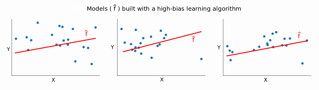
If $hat{f}$ doesn’t change too much as we change training sets, the variance is low, which proves our point: the greater the bias, the lower the variance.
Mathematically, it’s clear why we want low bias and low variance. As mentioned above, bias and variance can only add to a model’s error. From a more intuitive perspective though, we want low bias to avoid building a model that’s too simple. In most cases, a simple model performs poorly on training data, and it’s extremely likely to repeat the poor performance on test data.
Similarly, we want low variance to avoid building an overly complex model. Such a model fits almost perfectly all the data points in the training set. Training data, however, generally contains noise and is only a sample from a much larger population. An overly complex model captures that noise. And when tested on out-of-sample data, the performance is usually poor. That’s because the model learns the sample training data too well. It knows a lot about something and little about anything else.
In practice, however, we need to accept a trade-off. We can’t have both low bias and low variance, so we want to aim for something in the middle.
We’ll try to build some practical intuition for this trade-off as we generate and interpret learning curves below.
Learning curves – the basic idea
Let’s say we have some data and split it into a training set and validation set. We take one single instance (that’s right, one!) from the training set and use it to estimate a model. Then we measure the model’s error on the validation set and on that single training instance. The error on the training instance will be 0, since it’s quite easy to perfectly fit a single data point. The error on the validation set, however, will be very large. That’s because the model is built around a single instance, and it almost certainly won’t be able to generalize accurately on data that hasn’t seen before.
Now let’s say that instead of one training instance, we take ten and repeat the error measurements. Then we take fifty, one hundred, five hundred, until we use our entire training set. The error scores will vary more or less as we change the training set.
We thus have two error scores to monitor: one for the validation set, and one for the training sets. If we plot the evolution of the two error scores as training sets change, we end up with two curves. These are called learning curves.
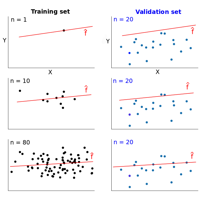
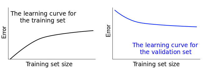
In a nutshell, a learning curve shows how error changes as the training set size increases. The diagram below should help you visualize the process described so far. On the training set column you can see that we constantly increase the size of the training sets. This causes a slight change in our models $hat{f}$.
In the first row, where n = 1 (n is the number of training instances), the model fits perfectly that single training data point. However, the very same model fits really bad a validation set of 20 different data points. So the model’s error is 0 on the training set, but much higher on the validation set.
As we increase the training set size, the model cannot fit perfectly anymore the training set. So the training error becomes larger. However, the model is trained on more data, so it manages to fit better the validation set. Thus, the validation error decreases. To remind you, the validation set stays the same across all three cases.
If we plotted the error scores for each training size, we’d get two learning curves looking similarly to these:
Learning curves give us an opportunity to diagnose bias and variance in supervised learning models. We’ll see how that’s possible in what follows.
Introducing the data
The learning curves plotted above are idealized for teaching purposes. In practice, however, they usually look significantly different. So let’s move the discussion in a practical setting by using some real-world data.
We’ll try to build regression models that predict the hourly electrical energy output of a power plant. The data we use come from Turkish researchers Pınar Tüfekci and Heysem Kaya, and can be downloaded from here. As the data is stored in a .xlsx file, we use pandas’ read_excel() function to read it in:
import pandas as pd

electricity = pd.read_excel('Folds5x2_pp.xlsx')

print(electricity.info())
electricity.head(3)
<class 'pandas.core.frame.DataFrame'>
RangeIndex: 9568 entries, 0 to 9567
Data columns (total 5 columns):
AT    9568 non-null float64
V     9568 non-null float64
AP    9568 non-null float64
RH    9568 non-null float64
PE    9568 non-null float64
dtypes: float64(5)
memory usage: 373.8 KB
None
| AT | V | AP | RH | PE | |
|---|---|---|---|---|---|
| 0 | 14.96 | 41.76 | 1024.07 | 73.17 | 463.26 |
| 1 | 25.18 | 62.96 | 1020.04 | 59.08 | 444.37 |
| 2 | 5.11 | 39.40 | 1012.16 | 92.14 | 488.56 |
Let’s quickly decipher each column name:
| Abbreviation | Full name |
|---|---|
| AT | Ambiental Temperature |
| V | Exhaust Vacuum |
| AP | Ambiental Pressure |
| RH | Relative Humidity |
| PE | Electrical Energy Output |
The PE column is the target variable, and it describes the net hourly electrical energy output. All the other variables are potential features, and the values for each are actually hourly averages (not net values, like for PE).
The electricity is generated by gas turbines, steam turbines, and heat recovery steam generators. According to the documentation of the data set, the vacuum level has an effect on steam turbines, while the other three variables affect the gas turbines. Consequently, we’ll use all of the feature columns in our regression models.
At this step we’d normally put aside a test set, explore the training data thoroughly, remove any outliers, measure correlations, etc. For teaching purposes, however, we’ll assume that’s already done and jump straight to generate some learning curves. Before we start that, it’s worth noticing that there are no missing values. Also, the numbers are unscaled, but we’ll avoid using models that have problems with unscaled data.
Deciding upon the training set sizes
Let’s first decide what training set sizes we want to use for generating the learning curves.
The minimum value is 1. The maximum is given by the number of instances in the training set. Our training set has 9568 instances, so the maximum value is 9568.
However, we haven’t yet put aside a validation set. We’ll do that using an 80:20 ratio, ending up with a training set of 7654 instances (80%), and a validation set of 1914 instances (20%). Given that our training set will have 7654 instances, the maximum value we can use to generate our learning curves is 7654.
For our case, here, we use these six sizes:
train_sizes = [1, 100, 500, 2000, 5000, 7654]
An important thing to be aware of is that for each specified size a new model is trained. If you’re using cross-validation, which we’ll do in this post, k models will be trained for each training size (where k is given by the number of folds used for cross-validation). To save code running time, it’s good practice to limit yourself to 5-10 training sizes.
The learning_curve() function from scikit-learn
We’ll use the learning_curve() function from the scikit-learn library to generate a learning curve for a regression model. There’s no need on our part to put aside a validation set because learning_curve() will take care of that.
In the code cell below, we:
- Do the required imports from
sklearn. - Declare the features and the target.
- Use
learning_curve()to generate the data needed to plot a learning curve. The function returns a tuple containing three elements: the training set sizes, and the error scores on both the validation sets and the training sets. Inside the function, we use the following parameters:estimator— indicates the learning algorithm we use to estimate the true model;X— the data containing the features;y— the data containing the target;train_sizes— specifies the training set sizes to be used;cv— determines the cross-validation splitting strategy (we’ll discuss this immediately);scoring— indicates the error metric to use; the intention is to use the mean squared error (MSE) metric, but that’s not a possible parameter forscoring; we’ll use the nearest proxy, negative MSE, and we’ll just have to flip signs later on.
from sklearn.linear_model import LinearRegression
from sklearn.model_selection import learning_curve

features = ['AT', 'V', 'AP', 'RH']
target = 'PE'

train_sizes, train_scores, validation_scores = learning_curve(
                                                   estimator = LinearRegression(), X = electricity[features],
                                                   y = electricity[target], train_sizes = train_sizes, cv = 5,
                                                   scoring = 'neg_mean_squared_error')
We already know what’s in train_sizes. Let’s inspect the other two variables to see what learning_curve() returned:
print('Training scores:nn', train_scores)
print('n', '-' * 70) # separator to make the output easy to read
print('nValidation scores:nn', validation_scores)
Training scores:

 [[ -0.          -0.          -0.          -0.          -0.        ]
 [-19.71230701 -18.31492642 -18.31492642 -18.31492642 -18.31492642]
 [-18.14420459 -19.63885072 -19.63885072 -19.63885072 -19.63885072]
 [-21.53603444 -20.18568787 -19.98317419 -19.98317419 -19.98317419]
 [-20.47708899 -19.93364211 -20.56091569 -20.4150839  -20.4150839 ]
 [-20.98565335 -20.63006094 -21.04384703 -20.63526811 -20.52955609]]

 ----------------------------------------------------------------------

Validation scores:

 [[-619.30514723 -379.81090366 -374.4107861  -370.03037109 -373.30597982]
 [ -21.80224219  -23.01103419  -20.81350389  -22.88459236  -23.44955492]
 [ -19.96005238  -21.2771561   -19.75136596  -21.4325615   -21.89067652]
 [ -19.92863783  -21.35440062  -19.62974239  -21.38631648  -21.811031  ]
 [ -19.88806264  -21.3183303   -19.68228562  -21.35019525  -21.75949097]
 [ -19.9046791   -21.33448781  -19.67831137  -21.31935146  -21.73778949]]
Since we specified six training set sizes, you might have expected six values for each kind of score. Instead, we got six rows for each, and every row has five error scores.
This happens because learning_curve() runs a k-fold cross-validation under the hood, where the value of k is given by what we specify for the cv parameter.
In our case, cv = 5, so there will be five splits. For each split, an estimator is trained for every training set size specified. Each column in the two arrays above designates a split, and each row corresponds to a test size. Below is a table for the training error scores to help you understand the process better:
| Training set size (index) | Split1 | Split2 | Split3 | Split4 | Split5 |
|---|---|---|---|---|---|
| 1 | 0 | 0 | 0 | 0 | 0 |
| 100 | -19.71230701 | -18.31492642 | -18.31492642 | -18.31492642 | -18.31492642 |
| 500 | -18.14420459 | -19.63885072 | -19.63885072 | -19.63885072 | -19.63885072 |
| 2000 | -21.53603444 | -20.18568787 | -19.98317419 | -19.98317419 | -19.98317419 |
| 5000 | -20.47708899 | -19.93364211 | -20.56091569 | -20.4150839 | -20.4150839 |
| 7654 | -20.98565335 | -20.63006094 | -21.04384703 | -20.63526811 | -20.52955609 |
To plot the learning curves, we need only a single error score per training set size, not 5. For this reason, in the next code cell we take the mean value of each row and also flip the signs of the error scores (as discussed above).
train_scores_mean = -train_scores.mean(axis = 1)
validation_scores_mean = -validation_scores.mean(axis = 1)

print('Mean training scoresnn', pd.Series(train_scores_mean, index = train_sizes))
print('n', '-' * 20) # separator
print('nMean validation scoresnn',pd.Series(validation_scores_mean, index = train_sizes))
Mean training scores

 1       -0.000000
100     18.594403
500     19.339921
2000    20.334249
5000    20.360363
7654    20.764877
dtype: float64

 --------------------

Mean validation scores

 1       423.372638
100      22.392186
500      20.862362
2000     20.822026
5000     20.799673
7654     20.794924
dtype: float64
Now we have all the data we need to plot the learning curves.
Before doing the plotting, however, we need to stop and make an important observation. You might have noticed that some error scores on the training sets are the same. For the row corresponding to training set size of 1, this is expected, but what about other rows? With the exception of the last row, we have a lot of identical values. For instance, take the second row where we have identical values from the second split onward. Why is that so?
This is caused by not randomizing the training data for each split. Let’s walk through a single example with the aid of the diagram below. When the training size is 500 the first 500 instances in the training set are selected. For the first split, these 500 instances will be taken from the second chunk. From the second split onward, these 500 instances will be taken from the first chunk. Because we don’t randomize the training set, the 500 instances used for training are the same for the second split onward. This explains the identical values from the second split onward for the 500 training instances case.
An identical reasoning applies to the 100 instances case, and a similar reasoning applies to the other cases.
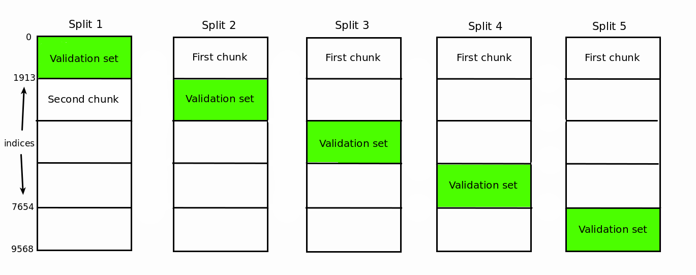
To stop this behavior, we need to set the shuffle parameter to True in the learning_curve() function. This will randomize the indices for the training data for each split. We haven’t randomized above for two reasons:
- The data comes pre-shuffled five times (as mentioned in the documentation) so there’s no need to randomize anymore.
- I wanted to make you aware about this quirk in case you stumble upon it in practice.
Finally, let’s do the plotting.
Learning curves – high bias and low variance
We plot the learning curves using a regular matplotlib workflow:
import matplotlib.pyplot as plt
%matplotlib inline

plt.style.use('seaborn')

plt.plot(train_sizes, train_scores_mean, label = 'Training error')
plt.plot(train_sizes, validation_scores_mean, label = 'Validation error')

plt.ylabel('MSE', fontsize = 14)
plt.xlabel('Training set size', fontsize = 14)
plt.title('Learning curves for a linear regression model', fontsize = 18, y = 1.03)
plt.legend()
plt.ylim(0,40)
(0, 40)
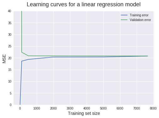
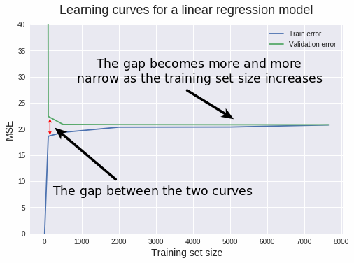
There’s a lot of information we can extract from this plot. Let’s proceed granularly.
When the training set size is 1, we can see that the MSE for the training set is 0. This is normal behavior, since the model has no problem fitting perfectly a single data point. So when tested upon the same data point, the prediction is perfect.
But when tested on the validation set (which has 1914 instances), the MSE rockets up to roughly 423.4. This relatively high value is the reason we restrict the y-axis range between 0 and 40. This enables us to read most MSE values with precision. Such a high value is expected, since it’s extremely unlikely that a model trained on a single data point can generalize accurately to 1914 new instances it hasn’t seen in training.
When the training set size increases to 100, the training MSE increases sharply, while the validation MSE decreases likewise. The linear regression model doesn’t predict all 100 training points perfectly, so the training MSE is greater than 0. However, the model performs much better now on the validation set because it’s estimated with more data.
From 500 training data points onward, the validation MSE stays roughly the same. This tells us something extremely important: adding more training data points won’t lead to significantly better models. So instead of wasting time (and possibly money) with collecting more data, we need to try something else, like switching to an algorithm that can build more complex models.
To avoid a misconception here, it’s important to notice that what really won’t help is adding more instances (rows) to the training data. Adding more features, however, is a different thing and is very likely to help because it will increase the complexity of our current model.
Let’s now move to diagnosing bias and variance. The main indicator of a bias problem is a high validation error. In our case, the validation MSE stagnates at a value of approximately 20. But how good is that? We’d benefit from some domain knowledge (perhaps physics or engineering in this case) to answer this, but let’s give it a try.
Technically, that value of 20 has MW$^2$ (megawatts squared) as units (the units get squared as well when we compute the MSE). But the values in our target column are in MW (according to the documentation). Taking the square root of 20 MW$^2$ results in approximately 4.5 MW. Each target value represents net hourly electrical energy output. So for each hour our model is off by 4.5 MW on average. According to this Quora answer, 4.5 MW is equivalent to the heat power produced by 4500 handheld hair dryers. And this would add up if we tried to predict the total energy output for one day or a longer period.
We can conclude that the an MSE of 20 MW$^2$ is quite large. So our model has a bias problem. But is it a low bias problem or a high bias problem?
To find the answer, we need to look at the training error. If the training error is very low, it means that the training data is fitted very well by the estimated model. If the model fits the training data very well, it means it has low bias with respect to that set of data.
If the training error is high, it means that the training data is not fitted well enough by the estimated model. If the model fails to fit the training data well, it means it has high bias with respect to that set of data.
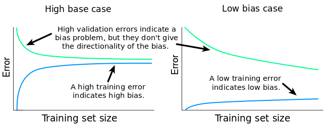
In our particular case, the training MSE plateaus at a value of roughly 20 MW$^2$. As we’ve already established, this is a high error score. Because the validation MSE is high, and the training MSE is high as well, our model has a high bias problem.
Now let’s move with diagnosing eventual variance problems. Estimating variance can be done in at least two ways:
- By examining the gap between the validation learning curve and training learning curve.
- By examining the training error: its value and its evolution as the training set sizes increase.
A narrow gap indicates low variance. Generally, the more narrow the gap, the lower the variance. The opposite is also true: the wider the gap, the greater the variance. Let’s now explain why this is the case.
As we’ve discussed earlier, if the variance is high, then the model fits training data too well. When training data is fitted too well, the model will have trouble generalizing on data that hasn’t seen in training. When such a model is tested on its training set, and then on a validation set, the training error will be low and the validation error will generally be high. As we change training set sizes, this pattern continues, and the differences between training and validation errors will determine that gap between the two learning curves.
The relationship between the training and validation error, and the gap can be summarized this way:
$$ gap = validation error – training error $$
So the bigger the difference between the two errors, the bigger the gap. The bigger the gap, the bigger the variance.
In our case, the gap is very narrow, so we can safely conclude that the variance is low.
High training MSE scores are also a quick way to detect low variance. If the variance of a learning algorithm is low, then the algorithm will come up with simplistic and similar models as we change the training sets. Because the models are overly simplified, they cannot even fit the training data well (they underfit the data). So we should expect high training MSEs. Hence, high training MSEs can be used as indicators of low variance.
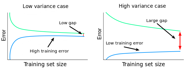
In our case, the training MSE plateaus at around 20, and we’ve already concluded that’s a high value. So besides the narrow gap, we now have another confirmation that we have a low variance problem.
So far, we can conclude that:
- Our learning algorithm suffers from high bias and low variance, underfitting the training data.
- Adding more instances (rows) to the training data is hugely unlikely to lead to better models under the current learning algorithm.
One solution at this point is to change to a more complex learning algorithm. This should decrease the bias and increase the variance. A mistake would be to try to increase the number of training instances.
Generally, these other two fixes also work when dealing with a high bias and low variance problem:
- Training the current learning algorithm on more features (to avoid collecting new data, you can generate easily polynomial features). This should lower the bias by increasing the model’s complexity.
- Decreasing the regularization of the current learning algorithm, if that’s the case. In a nutshell, regularization prevents the algorithm from fitting the training data too well. If we decrease regularization, the model will fit training data better, and, as a consequence, the variance will increase and the bias will decrease.
Learning curves – low bias and high variance
Let’s see how an unregularized Random Forest regressor fares here. We’ll generate the learning curves using the same workflow as above. This time we’ll bundle everything into a function so we can use it for later. For comparison, we’ll also display the learning curves for the linear regression model above.
### Bundling our previous work into a function ###

def learning_curves(estimator, data, features, target, train_sizes, cv):
    train_sizes, train_scores, validation_scores = learning_curve(
                                                 estimator, data[features], data[target], train_sizes = train_sizes,
                                                 cv = cv, scoring = 'neg_mean_squared_error')
    train_scores_mean = -train_scores.mean(axis = 1)
    validation_scores_mean = -validation_scores.mean(axis = 1)

    plt.plot(train_sizes, train_scores_mean, label = 'Training error')
    plt.plot(train_sizes, validation_scores_mean, label = 'Validation error')

    plt.ylabel('MSE', fontsize = 14)
    plt.xlabel('Training set size', fontsize = 14)
    title = 'Learning curves for a ' + str(estimator).split('(')[0] + ' model'
    plt.title(title, fontsize = 18, y = 1.03)
    plt.legend()
    plt.ylim(0,40)


### Plotting the two learning curves ###

from sklearn.ensemble import RandomForestRegressor

plt.figure(figsize = (16,5))

for model, i in [(RandomForestRegressor(), 1), (LinearRegression(),2)]:
    plt.subplot(1,2,i)
    learning_curves(model, electricity, features, target, train_sizes, 5)
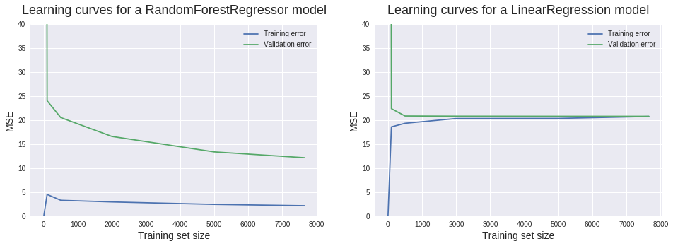
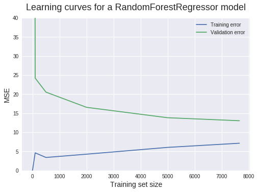
Now let’s try to apply what we’ve just learned. It’d be a good idea to pause reading at this point and try to interpret the new learning curves yourself.
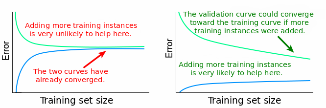
Looking at the validation curve, we can see that we’ve managed to decrease bias. There still is some significant bias, but not that much as before. Looking at the training curve, we can deduce that this time there’s a low bias problem.
The new gap between the two learning curves suggests a substantial increase in variance. The low training MSEs corroborate this diagnosis of high variance.
The large gap and the low training error also indicates an overfitting problem. Overfitting happens when the model performs well on the training set, but far poorer on the test (or validation) set.
One more important observation we can make here is that adding new training instances is very likely to lead to better models. The validation curve doesn’t plateau at the maximum training set size used. It still has potential to decrease and converge toward the training curve, similar to the convergence we see in the linear regression case.
So far, we can conclude that:
- Our learning algorithm (random forests) suffers from high variance and quite a low bias, overfitting the training data.
- Adding more training instances is very likely to lead to better models under the current learning algorithm.
At this point, here are a couple of things we could do to improve our model:
- Adding more training instances.
- Increase the regularization for our current learning algorithm. This should decrease the variance and increase the bias.
- Reducing the numbers of features in the training data we currently use. The algorithm will still fit the training data very well, but due to the decreased number of features, it will build less complex models. This should increase the bias and decrease the variance.
In our case, we don’t have any other readily available data. We could go into the power plant and take some measurements, but we’ll save this for another post (just kidding).
Let’s rather try to regularize our random forests algorithm. One way to do that is to adjust the maximum number of leaf nodes in each decision tree. This can be done by using the max_leaf_nodes parameter of RandomForestRegressor(). It’s not necessarily for you to understand this regularization technique. For our purpose here, what you need to focus on is the effect of this regularization on the learning curves.
learning_curves(RandomForestRegressor(max_leaf_nodes = 350), electricity, features, target, train_sizes, 5)
Not bad! The gap is now more narrow, so there’s less variance. The bias seems to have increased just a bit, which is what we wanted.
But our work is far from over! The validation MSE still shows a lot of potential to decrease. Some steps you can take toward this goal include:
- Adding more training instances.
- Adding more features.
- Feature selection.
- Hyperparameter optimization.
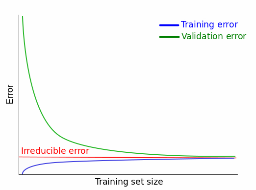
The ideal learning curves and the irreducible error
Learning curves constitute a great tool to do a quick check on our models at every point in our machine learning workflow. But how do we know when to stop? How do we recognize the perfect learning curves?
For our regression case before, you might think that the perfect scenario is when both curves converge toward an MSE of 0. That’s a perfect scenario, indeed, but, unfortunately, it’s not possible. Neither in practice, neither in theory. And this is because of something called irreducible error.
When we build a model to map the relationship between the features $X$ and the target $Y$, we assume that there is such a relationship in the first place. Provided the assumption is true, there is a true model $f$ that describes perfectly the relationship between $X$ and $Y$, like so:
$$ Y = f(X) + irreducible error (1)$$
But why is there an error?! Haven’t we just said that $f$ describes the relationship between X and Y perfectly?!
There’s an error there because $Y$ is not only a function of our limited number of features $X$. There could be many other features that influence the value of $Y$. Features we don’t have. It might also be the case that $X$ contains measurement errors. So, besides $X$, $Y$ is also a function of $irreducible error$.
Now let’s explain why this error is irreducible. When we estimate $f(X)$ with a model $hat{f}(X)$, we introduce another kind of error, called reducible error:
$$ f(X) = hat{f}(X) + reducible error (2)$$
Replacing $f(X)$ in $(1)$ we get:
$$ Y = hat{f}(X) + reducible error + irreducible error (3)$$
Error that is reducible can be reduced by building better models. Looking at equation $(2)$ we can see that if the $reducible error$ is 0, our estimated model $hat{f}(X)$ is equal to the true model $f(X)$. However, from $(3)$ we can see that $irreducible error$ remains in the equation even if $reducible error$ is 0. From here we deduce that no matter how good our model estimate is, generally there still is some error we cannot reduce. And that’s why this error is considered irreducible.
This tells us that that in practice the best possible learning curves we can see are those which converge to the value of some irreducible error, not toward some ideal error value (for MSE, the ideal error score is 0; we’ll see immediately that other error metrics have different ideal error values).
In practice, the exact value of the irreducible error is almost always unknown. We also assume that the irreducible error is independent of $X$. This means that we cannot use $X$ to find the true irreducible error. Expressing the same thing in the more precise language of mathematics, there’s no function $g$ to map $X$ to the true value of the irreducible error:
$$ irreducible error neq g(X)$$
So there’s no way to know the true value of the irreducible error based on the data we have. In practice, a good workaround is to try to lower the error score as much as possible, while keeping in mind that the limit is given by some irreducible error.
What about classification?
So far, we’ve learned about learning curves in a regression setting. For classification tasks, the workflow is almost identical. The main difference is that we’ll have to choose another error metric – one that is suitable for evaluating the performance of a classifier. Let’s see an example:
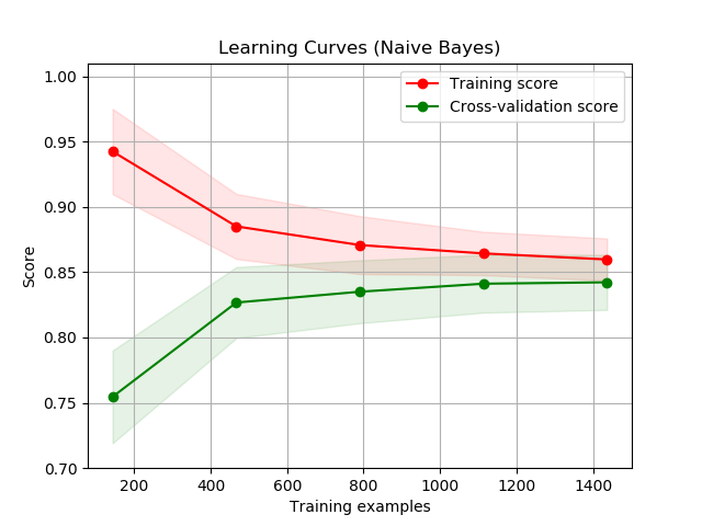
Unlike what we’ve seen so far, notice that the learning curve for the training error is above the one for the validation error. This is because the score used, accuracy, describes how good the model is. The higher the accuracy, the better. The MSE, on the other side, describes how bad a model is. The lower the MSE, the better.
This has implications for the irreducible error as well. For error metrics that describe how bad a model is, the irreducible error gives a lower bound: you cannot get lower than that. For error metrics that describe how good a model is, the irreducible error gives an upper bound: you cannot get higher than that.
As a side note here, in more technical writings the term Bayes error rate is what’s usually used to refer to the best possible error score of a classifier. The concept is analogous to the irreducible error.
Next steps
Learning curves constitute a great tool to diagnose bias and variance in any supervised learning algorithm. We’ve learned how to generate them using scikit-learn and matplotlib, and how to use them to diagnose bias and variance in our models.
To reinforce what you’ve learned, these are some next steps to consider:
- Generate learning curves for a regression task using a different data set.
- Generate learning curves for a classification task.
- Generate learning curves for a supervised learning task by coding everything from scratch (don’t use
learning_curve()from scikit-learn). Using cross-validation is optional. - Compare learning curves obtained without cross-validating with curves obtained using cross-validation. The two kinds of curves should be for the same learning algorithm.