Now that the NBA season is done, we have complete data from this year’s NBA rookies. In the past I have tried to predict NBA rookies’ future performance using regressionmodels. In this post I am again trying to predict rookies’ future performance, but now using using a classification approach. When using a classification approach, I predict whether player X will be a “great,” “average,” or “poor” player rather than predicting exactly how productive player X will be.
Much of this post re-uses code from the previous posts, so I skim over some of the repeated code.
As usual, I will post all code as a jupyter notebook on my github.
1234567
#import some libraries and tell ipython we want inline figures rather than interactive figures. importmatplotlib.pyplotasplt,pandasaspd,numpyasnp,matplotlibasmplfrom__future__importprint_function%matplotlibinlineplt.style.use('ggplot')#im addicted to ggplot. so pretty.
Load the data. Reminder – this data is available on my github.
12345678
rookie_df=pd.read_pickle('nba_bballref_rookie_stats_2016_Apr_16.pkl')#here's the rookie year datarook_games=rookie_df['Career Games']>50#only attempting to predict players that have played at least 50 gamesrook_year=rookie_df['Year']>1980#only attempting to predict players from after 1980#remove rookies from before 1980 and who have played less than 50 games. I also remove some features that seem irrelevant or unfairrookie_df_games=rookie_df[rook_games&rook_year]#only players with more than 50 games. rookie_df_drop=rookie_df_games.drop(['Year','Career Games','Name'],1)
fromsklearn.preprocessingimportStandardScalerdf=pd.read_pickle('nba_bballref_career_stats_2016_Apr_15.pkl')df=df[df['G']>50]df_drop=df.drop(['Year','Name','G','GS','MP','FG','FGA','FG%','3P','2P','FT','TRB','PTS','ORtg','DRtg','PER','TS%','3PAr','FTr','ORB%','DRB%','TRB%','AST%','STL%','BLK%','TOV%','USG%','OWS','DWS','WS','WS/48','OBPM','DBPM','BPM','VORP'],1)X=df_drop.as_matrix()#take data out of dataframeScaleModel=StandardScaler().fit(X)#make sure each feature has 0 mean and unit variance. X=ScaleModel.transform(X)
In the past I used k-means to group players according to their performance (see my post on grouping players for more info). Here, I use a gaussian mixture model (GMM) to group the players. I use the GMM model because it assigns each player a “soft” label rather than a “hard” label. By soft label I mean that a player simultaneously belongs to several groups. For instance, Russell Westbrook belongs to both my “point guard” group and my “scorers” group. K-means uses hard labels where each player can only belong to one group. I think the GMM model provides a more accurate representation of players, so I’ve decided to use it in this post. Maybe in a future post I will spend more time describing it.
For anyone wondering, the GMM groupings looked pretty similar to the k-means groupings.
12345678910111213
fromsklearn.mixtureimportGMMfromsklearn.decompositionimportPCAreduced_model=PCA(n_components=5,whiten=True).fit(X)reduced_data=reduced_model.transform(X)#transform data into the 5 PCA components spaceg=GMM(n_components=6).fit(reduced_data)#6 clusters. like the k-means modelnew_labels=g.predict(reduced_data)predictions=g.predict_proba(reduced_data)#generate values describing "how much" each player belongs to each group forxinnp.unique(new_labels):Label='Category%d'%xdf[Label]=predictions[:,x]
In this past I have attempted to predict win shares per 48 minutes. I am using win shares as a dependent variable again, but I want to categorize players.
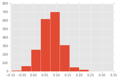
Below I create a histogram of players’ win shares per 48.
I split players into 4 groups which I will refer to as “bad,” “below average,” “above average,” and “great”: Poor players are the bottom 10% in win shares per 48, Below average are the 10-50th percentiles, Above average and 50-90th percentiles, Great are the top 10%. This assignment scheme is relatively arbitrary; the model performs similarly with different assignment schemes.
12345678
plt.hist(df['WS/48']);df['perf_cat']=0df.loc[df['WS/48']<np.percentile(df['WS/48'],10),'perf_cat']=1#category 1 players are bottom 10%df.loc[(df['WS/48']<np.percentile(df['WS/48'],50))&(df['WS/48']>=np.percentile(df['WS/48'],10)),'perf_cat']=2df.loc[(df['WS/48']<np.percentile(df['WS/48'],90))&(df['WS/48']>=np.percentile(df['WS/48'],50)),'perf_cat']=3df.loc[df['WS/48']>=np.percentile(df['WS/48'],90),'perf_cat']=4#category 4 players are top 10%perc_in_cat=[np.mean(df['perf_cat']==x)forxinnp.unique(df['perf_cat'])];perc_in_cat#print % of palyers in each category as a sanity check
My goal is to use rookie year performance to classify players into these 4 categories. I have a big matrix with lots of data about rookie year performance, but the reason that I grouped player using the GMM is because I suspect that players in the different groups have different “paths” to success. I am including the groupings in my classification model and computing interaction terms. The interaction terms will allow rookie performance to produce different predictions for the different groups.
By including interaction terms, I include quite a few predictor features. I’ve printed the number of predictor features and the number of predicted players below.
12345678910111213141516
fromsklearnimportpreprocessingdf_drop=df[df['Year']>1980]forxinnp.unique(new_labels):Label='Category%d'%xrookie_df_drop[Label]=df_drop[Label]#give rookies the groupings produced by the GMM modelX=rookie_df_drop.as_matrix()#take data out of dataframe poly=preprocessing.PolynomialFeatures(2,interaction_only=True)#create interaction terms.X=poly.fit_transform(X)Career_data=df[df['Year']>1980]Y=Career_data['perf_cat']#get predictor dataprint(np.shape(X))print(np.shape(Y))
(1703, 1432)
(1703,)
Now that I have all the features, it’s time to try and predict which players will be poor, below average, above average, and great. To create these predictions, I will use a logistic regression model.
Because I have so many predictors, correlation between predicting features and over-fitting the data are major concerns. I use regularization and cross-validation to combat these issues.
Specifically, I am using l2 regularization and k-fold 5 cross-validation. Within the cross-validation, I am trying to estimate how much regularization is appropriate.
Some important notes – I am using “balanced” weights which tells the model that worse to incorrectly predict the poor and great players than the below average and above average players. I do this because I don’t want the model to completely ignore the less frequent classifications. Second, I use the multi_class multinomial because it limits the number of models I have to fit.
123456789
fromsklearnimportlinear_modelfromsklearn.metricsimportaccuracy_scorelogreg=linear_model.LogisticRegressionCV(Cs=[0.0008],cv=5,penalty='l2',n_jobs=-1,class_weight='balanced',max_iter=15000,multi_class='multinomial')est=logreg.fit(X,Y)score=accuracy_score(Y,est.predict(X))#calculate the % correct print(score)
0.738109219025
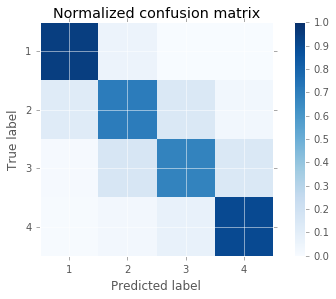
Okay, the model did pretty well, but lets look at where the errors are coming from. To visualize the models accuracy, I am using a confusion matrix. In a confusion matrix, every item on the diagnonal is a correctly classified item. Every item off the diagonal is incorrectly classified. The color bar’s axis is the percent correct. So the dark blue squares represent cells with more items.
It seems the model is best at predicting poor players and great players. It makes more errors when trying to predict the more average players.
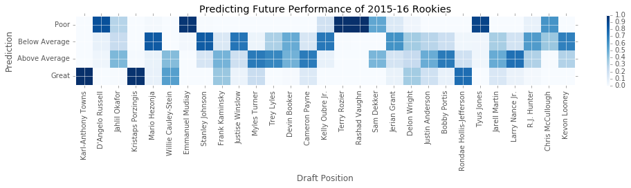
Lets look at what the model predicts for this year’s rookies. Below I modified two functions that I wrote for a previous post. The first function finds a particular year’s draft picks. The second function produces predictions for each draft pick.
defgather_draftData(Year):importurllib2frombs4importBeautifulSoupimportpandasaspdimportnumpyasnpdraft_len=30defconvert_float(val):try:returnfloat(val)exceptValueError:returnnp.nanurl='http://www.basketball-reference.com/draft/NBA_'+str(Year)+'.html'html=urllib2.urlopen(url)soup=BeautifulSoup(html,"lxml")draft_num=[soup.findAll('tbody')[0].findAll('tr')[i].findAll('td')[0].textforiinrange(draft_len)]draft_nam=[soup.findAll('tbody')[0].findAll('tr')[i].findAll('td')[3].textforiinrange(draft_len)]draft_df=pd.DataFrame([draft_num,draft_nam]).Tdraft_df.columns=['Number','Name']df.index=range(np.size(df,0))returndraft_dfdefplayer_prediction__regressionModel(PlayerName):clust_df=pd.read_pickle('nba_bballref_career_stats_2016_Apr_15.pkl')clust_df=clust_df[clust_df['Name']==PlayerName]clust_df=clust_df.drop(['Year','Name','G','GS','MP','FG','FGA','FG%','3P','2P','FT','TRB','PTS','ORtg','DRtg','PER','TS%','3PAr','FTr','ORB%','DRB%','TRB%','AST%','STL%','BLK%','TOV%','USG%','OWS','DWS','WS','WS/48','OBPM','DBPM','BPM','VORP'],1)new_vect=ScaleModel.transform(clust_df.as_matrix().reshape(1,-1))reduced_data=reduced_model.transform(new_vect)predictions=g.predict_proba(reduced_data)forxinnp.unique(new_labels):Label='Category%d'%xclust_df[Label]=predictions[:,x]Predrookie_df=pd.read_pickle('nba_bballref_rookie_stats_2016_Apr_16.pkl')Predrookie_df=Predrookie_df[Predrookie_df['Name']==PlayerName]Predrookie_df=Predrookie_df.drop(['Year','Career Games','Name'],1)forxinnp.unique(new_labels):Label='Category%d'%xPredrookie_df[Label]=clust_df[Label]#give rookies the groupings produced by the GMM modelpredX=Predrookie_df.as_matrix()#take data out of dataframepredX=poly.fit_transform(predX)predictions2=est.predict_proba(predX)return{'Name':PlayerName,'Group':predictions,'Prediction':predictions2[0]}
Below I create a plot depicting the model’s predictions. On the y-axis are the four classifications. On the x-axis are the players from the 2015 draft. Each cell in the plot is the probability of a player belonging to one of the classifications. Again, dark blue means a cell or more likely. Good news for us T-Wolves fans! The model loves KAT.
1234567891011121314151617181920212223
draft_df=gather_draftData(2015)draft_df['Name'][14]='Kelly Oubre Jr.'#annoying name inconsistencies plt.subplots(figsize=(14,6));draft_df=draft_df.drop(25,0)#spurs' 1st round pick has not played yetpredictions=[]fornameindraft_df['Name']:draft_num=draft_df[draft_df['Name']==name]['Number']predict_dict=player_prediction__regressionModel(name)predictions.append(predict_dict['Prediction'])plt.imshow(np.array(predictions).T,interpolation='nearest',cmap=plt.cm.Blues,vmin=0.0,vmax=1.0)plt.title('Predicting Future Performance of 2015-16 Rookies')plt.colorbar(shrink=0.25)tick_marks=np.arange(len(np.unique(df['perf_cat'])))plt.xticks(range(0,29),draft_df['Name'],rotation=90)plt.yticks(range(0,4),['Poor','Below Average','Above Average','Great'])plt.tight_layout()plt.ylabel('Prediction')plt.xlabel('Draft Position');