With the presidential election less than a week out, I thought it would be fun to make my own predictions about the race. There are plenty of blog and websites that forecast the election, but there aren’t that many that tell you how exactly their “secret models” work OR show you how to do it yourself. Well good news is that’s exactly what I’m going to do 😉
In this post I’ll break down the presidential election on a state by state basis and show you how you can use the polls to simulate and predict the likelihood of each candidate to win.
To do all this I’m going to be using R, which is a statistical programming language. It allows you to analyze data quickly and effeciently. If you don’t care about R, just skip over the code parts :). The post will still make sense.
The Data
To predict the election we need to data sources:
- electoral college
- recent polling data
You can find information about the electoral college a lot of places. I did a quick google search and found a cleaned and prepared CSV file on github. As I mentioned, I’m going to be using R for this post so it’s time to dust off my R moves.
f <- "https://raw.githubusercontent.com/chris-taylor/USElection/master/data/electoral-college-votes.csv"
electoral.college <- read.csv(f, header=FALSE)
names(electoral.college) <- c("state", "electoral_votes")
head(electoral.college)
       state electoral_votes
1    Alabama               9
2     Alaska               3
3    Arizona              11
4   Arkansas               6
5 California              55
6   Colorado               9
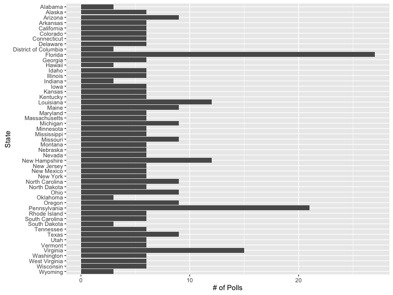
Ok so we’ve got our electoral college, now we need some polls! There are plenty of places to go for polling data but I settled on the electionprojection.com. In addition to rhyming I found that the site structure was really simple and made it easy to work with the data. I grabbed data for each state from the site and wound up with a nicely formatted data frame that I could then use to start digging into things.
You can see the entire code snippet here but the important part is that I’m using the readHTMLTable function from the XML package. It’s extremely good at scraping HTML tables from the web. For example, take a look at how easy it is to grab the most recent Florida polls.
library(XML)
url <- "http://www.electionprojection.com/latest-polls/florida-presidential-polls-trump-vs-clinton-vs-johnson-vs-stein.php"
readHTMLTable(url, stringsAsFactors=FALSE)[[3]]
| Firm | Dates | Sample | Clinton | Trump | Johnson | Stein | Spread | |
|---|---|---|---|---|---|---|---|---|
| 1 | EP Poll Average | 44.6 | 45.0 | 3.3 | 1.7 | Trump +0.4 | ||
| 2 | Remington Research (R) | 10/30 – 10/30 | 989 LV | 44 | 48 | 2 | — | Trump +4 |
| 3 | Emerson | 10/26 – 10/27 | 500 LV | 46 | 45 | 4 | — | Clinton +1 |
| 4 | NY Times/Siena | 10/25 – 10/27 | 814 LV | 42 | 46 | 4 | 2 | Trump +4 |
| 5 | Gravis Marketing (R) | 10/25 – 10/26 | 1301 RV | 48 | 47 | 1 | — | Clinton +1 |
| 6 | NBC News/Wall St Journal | 10/25 – 10/26 | 779 LV | 45 | 44 | 5 | 2 | Clinton +1 |
| 7 | Dixie Strategies | 10/25 – 10/26 | 698 LV | 42 | 46 | 2 | 1 | Trump +4 |
| 8 | Univ. of North Florida | 10/20 – 10/25 | 819 LV | 43 | 39 | 6 | 2 | Clinton +4 |
| 9 | Bloomberg | 10/21 – 10/24 | 953 LV | 43 | 45 | 4 | 2 | Trump +2 |
| 10 | Bay News 9/SurveyUSA | 10/20 – 10/24 | 1251 LV | 48 | 45 | 2 | 1 | Clinton +3 |
One of the first things that you notice is that some states are polled more frequently than others. This isn’t super surprising. You’d expect that the incremental gain on polling a state like Alabama (3 times), which barring some miracle, will go to Trump, is very low. Compare that to battle ground states like Florida (27) or Pennsylvania (21) where the impact of new information can have a dramatic impact on how we predict who will be the next president.
Which polls mean the most?
One of the key elements to this post is that we need a way to weight the value of each poll. Generally speaking, the older the poll the less value the data provides (think of a pre/post-Comey probe). We’re going to take a very simple, yet effective approach to this. We’ll be assigning exponentially decaying weights to each poll. This sounds fancy but it’s actually quite simple. All it means is that the most recent polls will be weighted significantly higher than older polls. So you can think of the weights decreasing like this:
weight <- function(i) {
  exp(1)*1 / exp(i)
}

w <- data.frame(poll=1:8, weight=weight(1:8))
ggplot(w, aes(x=poll, weight=weight)) +
  geom_bar() +
  scale_x_continuous("nth poll", breaks=1:8) +
  scale_y_continuous("weight")
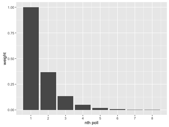
What you’ll notice is that by the time you get to the 7th to last poll, the poll is practically not being counted. So what really happens is that the exponential weights act as a smoothing function, taking into account the freshest. There are lots of ways to do this, this is just one quick, simple, and efffective technique.
Simulating Elections
Now it’s time for the fun stuff. We’re going to simulate our own election. What’s this? Do I have some sort of time machine or Groundhog Day style curse that allows me to experience November 7th over and over? No sadly (or maybe thankfully) I don’t. I have randomness instead.
I’m going to use the most basic of Monte Carlo (yes by far the sexiest statistical technique) simulations to generate elections synthetically. The approach I’ll use is, again, very simple. The biggest unknown in predicting the election is knowing how accurate the polls actually are. If we had perfect polling data then we might as well all stay home next Tuesday and catch up on our reading. But alas (or again maybe thankfully) we don’t! So what we’re going to do to account for this is to randomly vary the results from our polling data to generate “what if” outcomes.
election.sim <- function() {
  ddply(results, .(state), function(polls.state) {
    polls.state$.id <- NULL
    polls.state$id <- cumsum(!duplicated(polls.state$id))
    polls.state$weight <- weight(polls.state$id)
    polls.state$weighted_vote <- polls.state$vote * polls.state$weight

    tally <- ddply(polls.state, .(candidate), function(p) {
      r <- rnorm(nrow(p), 1, .15)
      data.frame(weighted_vote=sum(p$weighted_vote * r))
    })
    tally <- head(tally, 3)
    tally$estimated_popular_vote <- tally$weighted_vote / sum(tally$weighted_vote)
    tally
  })
}
It’s not an exact science, but it’ll give us a fantastic picture of the possible election outcomes and how likely they are to happen. Let’s start by simulating 1 election.
We’ll start by splitting our data up by state. This is obviously important since the U.S. election is decided not by the popular vote but by the electoral college. For you foreigners from other nations this will seem strange but just go with it.
Once we have the state level data, we’ll apply our weights to each poll and then sum the total weighted votes for that candidate in each state. Lastly we’ll apply a random variable to each candidates vote total to create our Monte Carlo simulation. I’m using a normal distribution with a mean of 1 and variance of 0.15 to vary the vote totals for each candidate. This is a pretty liberal amount of variance but I wanted to err on the side of casting my net too wide. There are also more advanced ways to do this (expecially if you have the error reported by the polls, which unfortunately I do not) but I’m trying to keep things simple.
We’ll multiply each candidate’s total by this number and then recalculate the % of the weighted popular vote each candidate received in that state and voila! We just simulated an election. We’ll get a little fancy and use the pseudo-official colors for each party. Splitting out the results for a single simulation, you can see who won each state.
library(ggplot2)
(election <- election.sim())
colormap <- c(Clinton="#179ee0", Trump="#ff5d40", Johnson="#f6b900")
ggplot(election, aes(x=candidate, weight=estimated_popular_vote, fill=candidate)) +
  geom_bar() +
  facet_wrap(~state) +
  scale_fill_manual(values=colormap) +
  scale_y_continuous(labels = scales::percent, breaks=c(0, 0.25, 0.5, 0.75, 1)) +
  theme(axis.title.x=element_blank(),
        axis.text.x=element_blank(),
        axis.ticks.x=element_blank(),
        axis.title.y=element_blank())
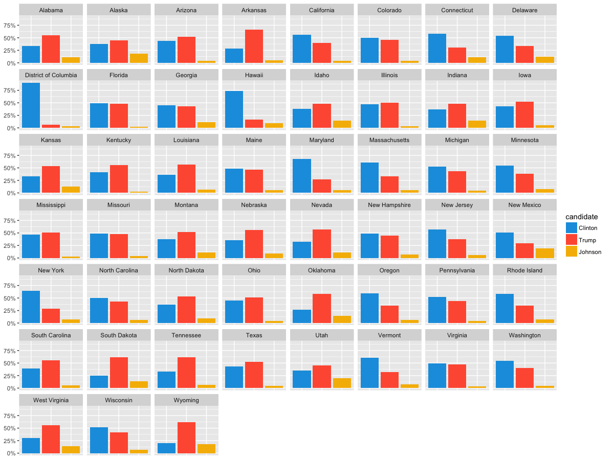
Populate vote results by state for a single simulation
So just do that but 10,000 more times
So simulating a single election is cool but it’s not really all that meaningful. What’s a lot cooler is to do something like 1,000 or 10,000 simulations. Doing 10,000 simulations increases the likelihood of rare-events surfacing–for example, Gary Johnson winning an electoral vote.
simulated.state.results <- ldply(1:10000, function(i) {
  election <- election.sim()
  election.results <- dcast(election, state ~ candidate, value.var="estimated_popular_vote")
  election.results <- merge(election.results, electoral.college, by.x="state", by.y="state", all.x = TRUE)
  candidates <- c("Clinton", "Trump", "Johnson")
  election.results$winner <- candidates[max.col(election.results[,candidates])]
  election.results$sim_id <- UUIDgenerate()
  election.results
}, .progress="text")
When we look at 10,000 simulated elections, we see some of the following interesting scenarios:
- Clinton wins election: 89%
- Clinton wins in landslide (400 or more electoral votes): 0.11%
- Trump wins in landslide: 0%
We could go on forever, but this gives you an idea for what you can do with simulation!
You can also start to take a look at the distributions of the outputs to get a better sense for what’s going on. Take for instance the # of electoral votes received. If we look at Clinton, Trump, and Johnson you get the following distributions:
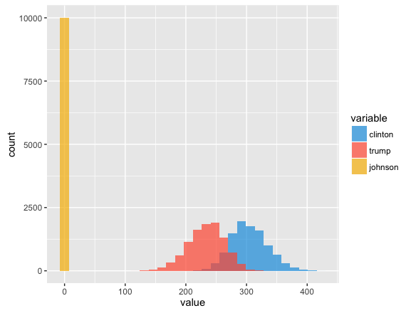
What this tells us is that we’re pretty damn sure Johnson is going to have 0 electoral votes. Sorry Gary. Let’s drill into Trump and Clinton. This is a great way to visualize sensitivity analysis. You can see the theoretical minimum, maximum, and likely # of electoral votes each candidate will get.
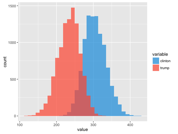
Ok so after all this let’s answer the simplest question. Who will win? No surprise, our model is indicating Hilary is going to win by a fair margin. But what’s also interesting is seeing how our simulation stacks up to some of the experts.
That’s the mean or most likely case, but what about the simulation? Well our simulation had Clinton winning 89% of the time (though note, this is down from 95% when I first started writing this post last week).
State Level
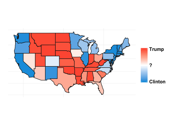
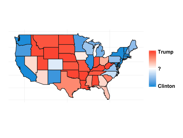
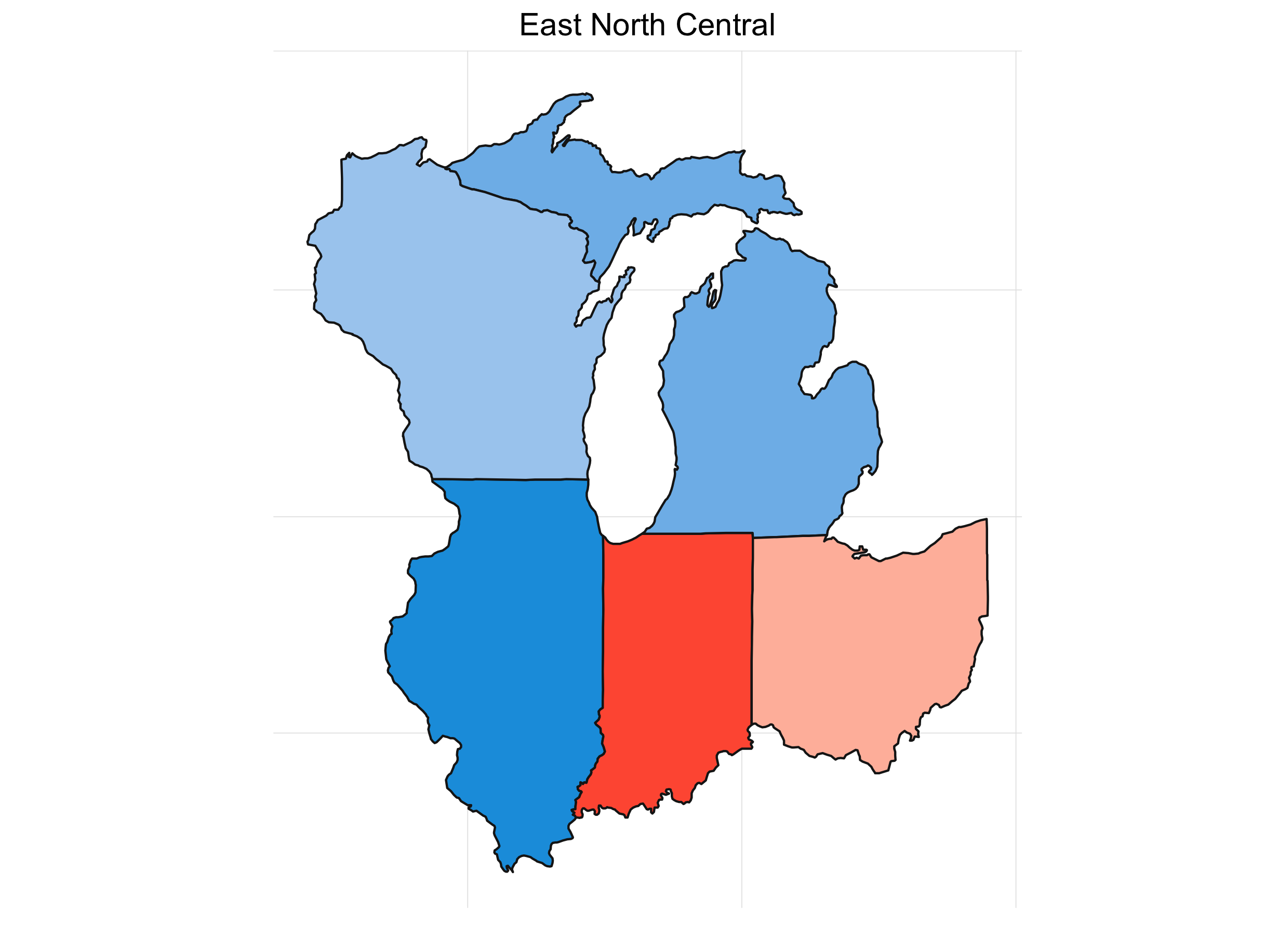
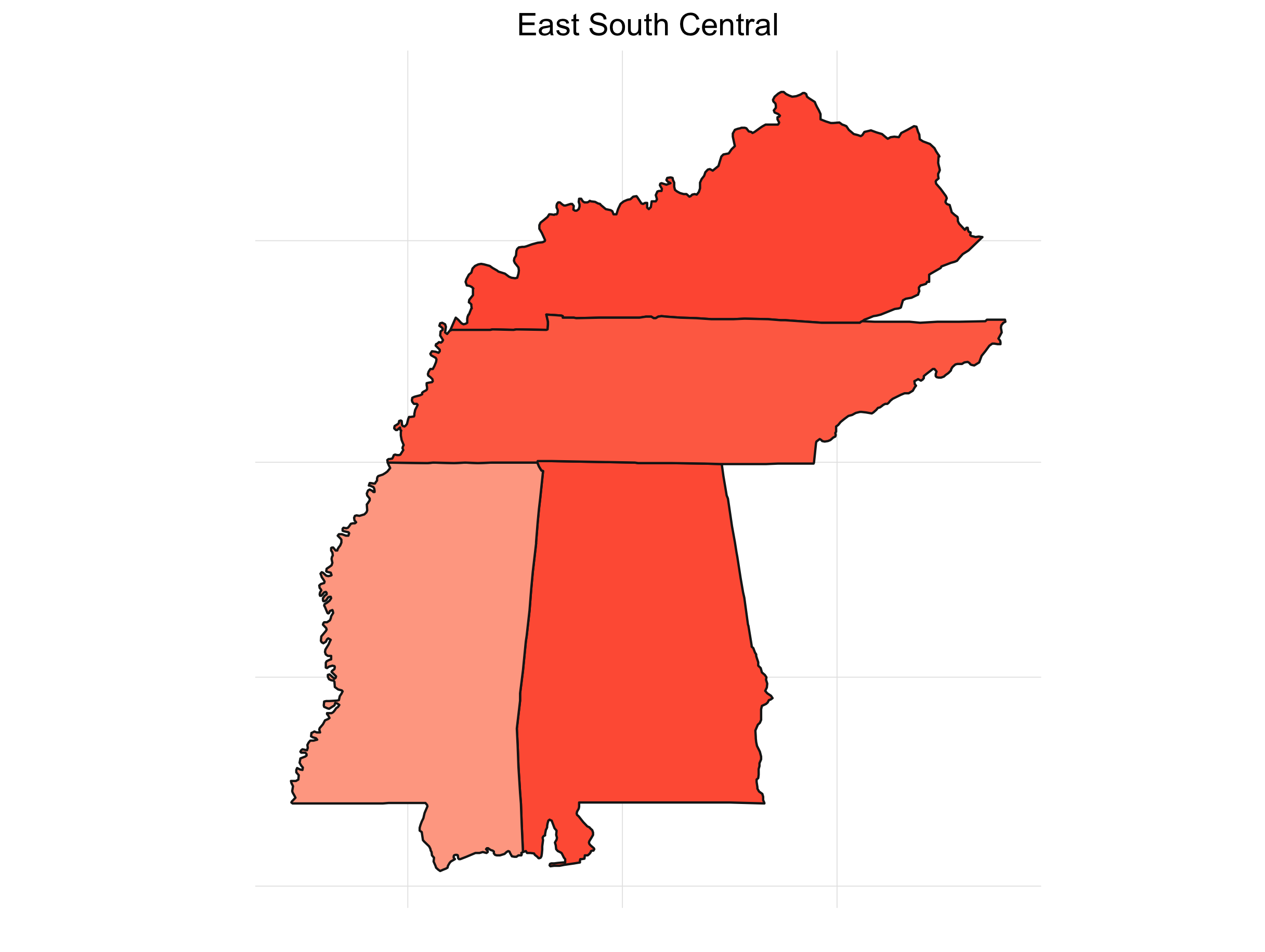
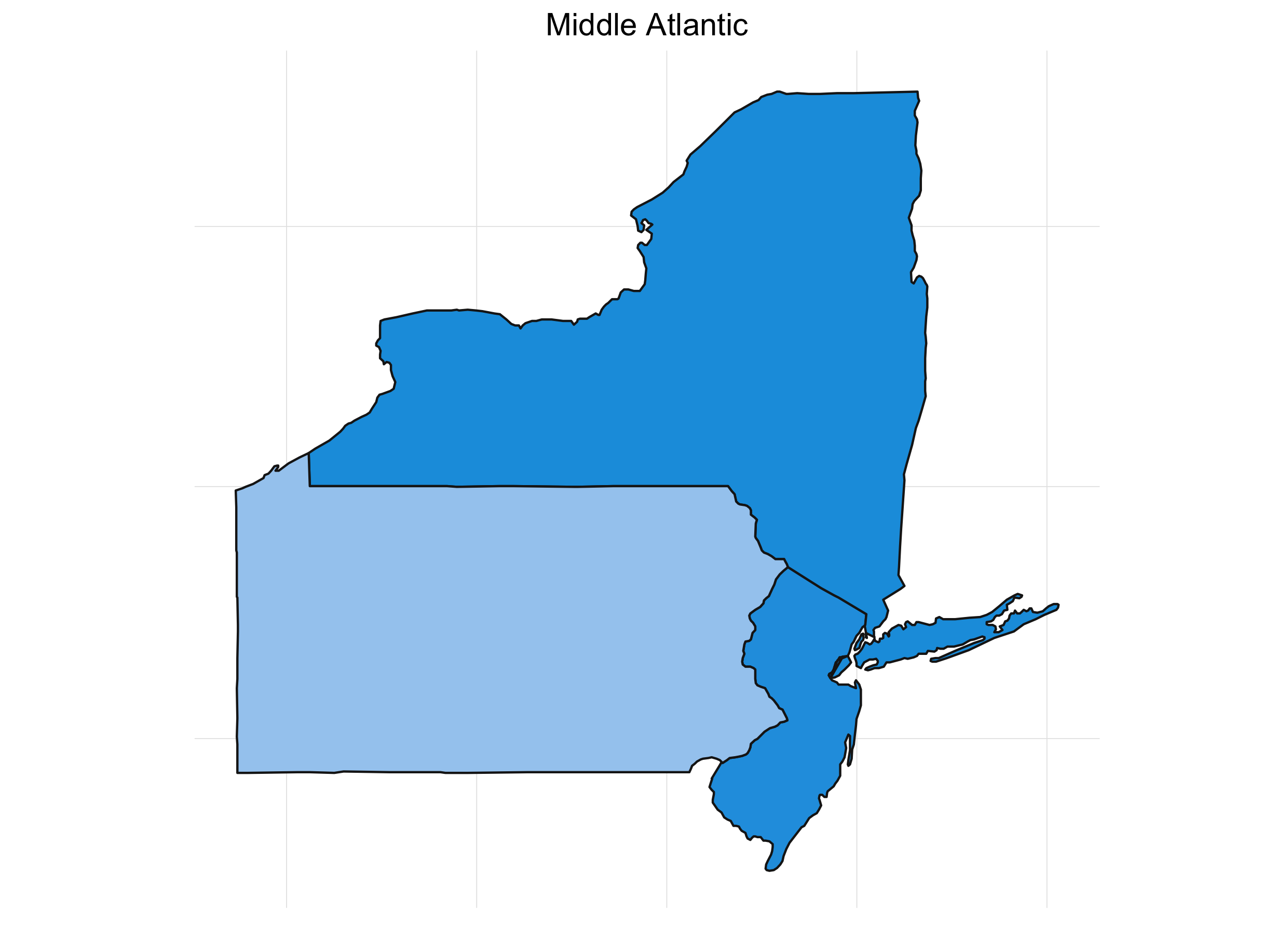
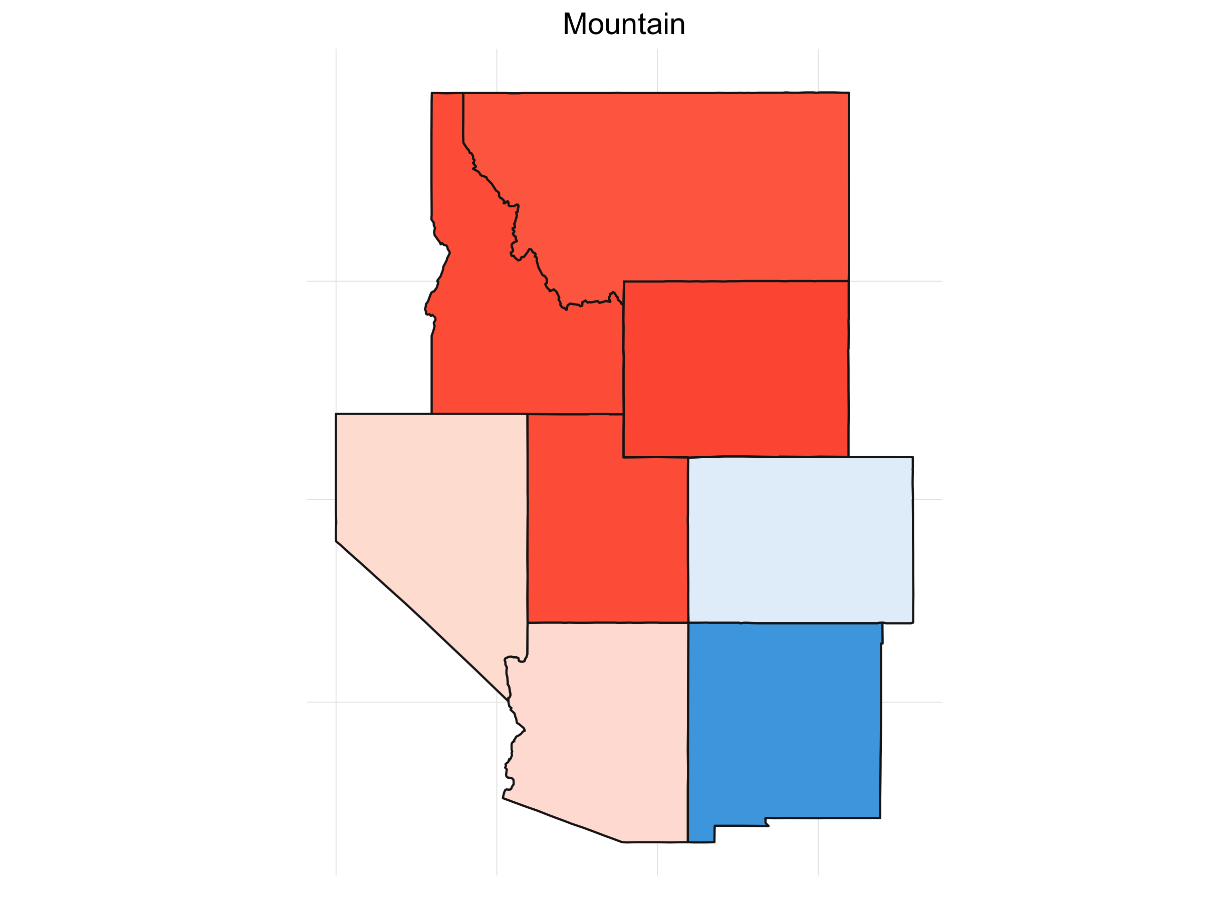
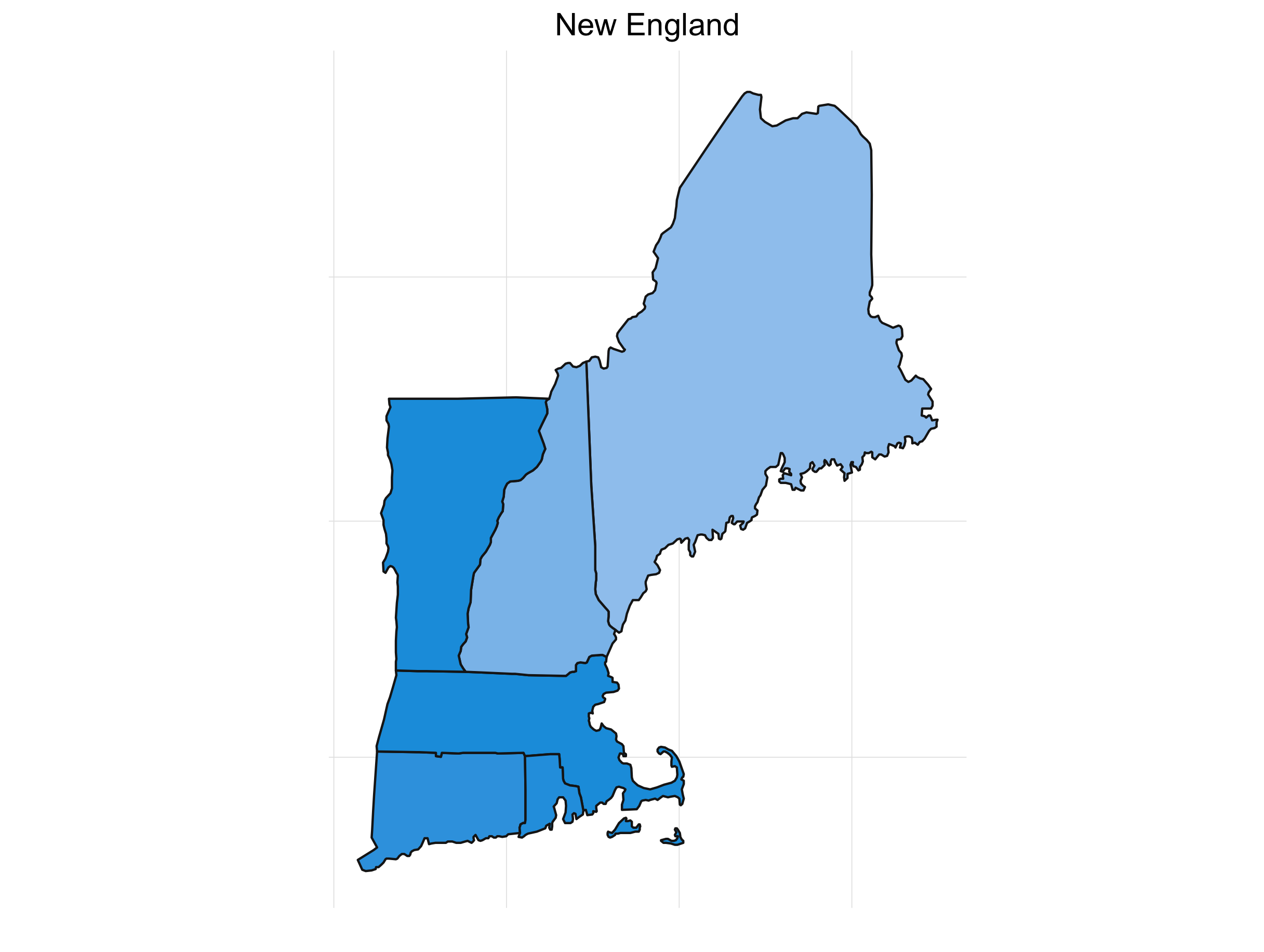
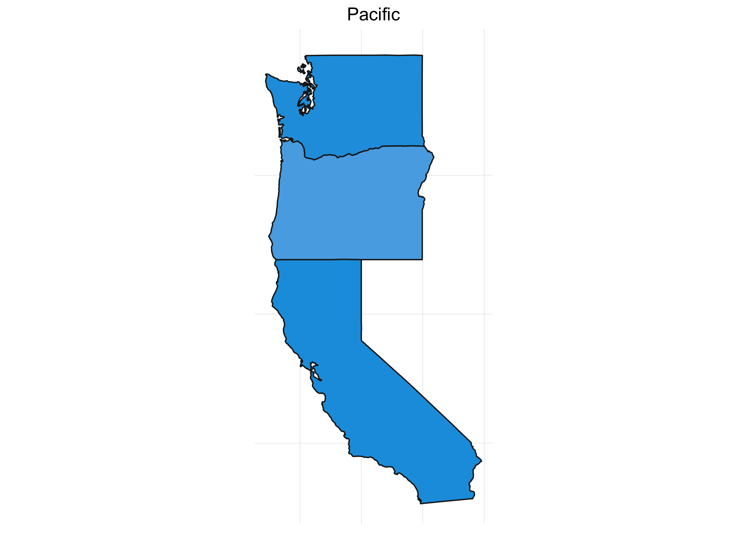
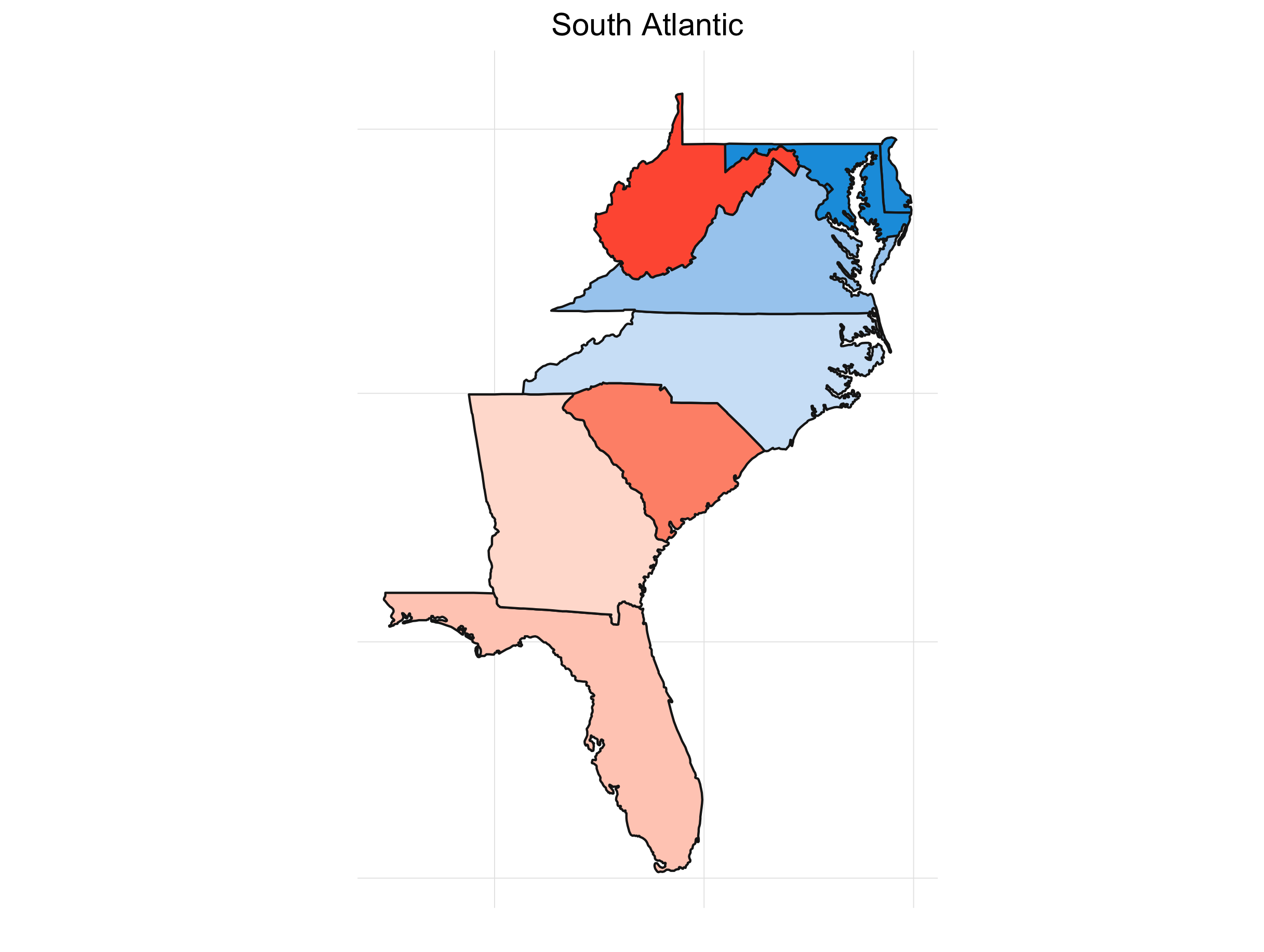
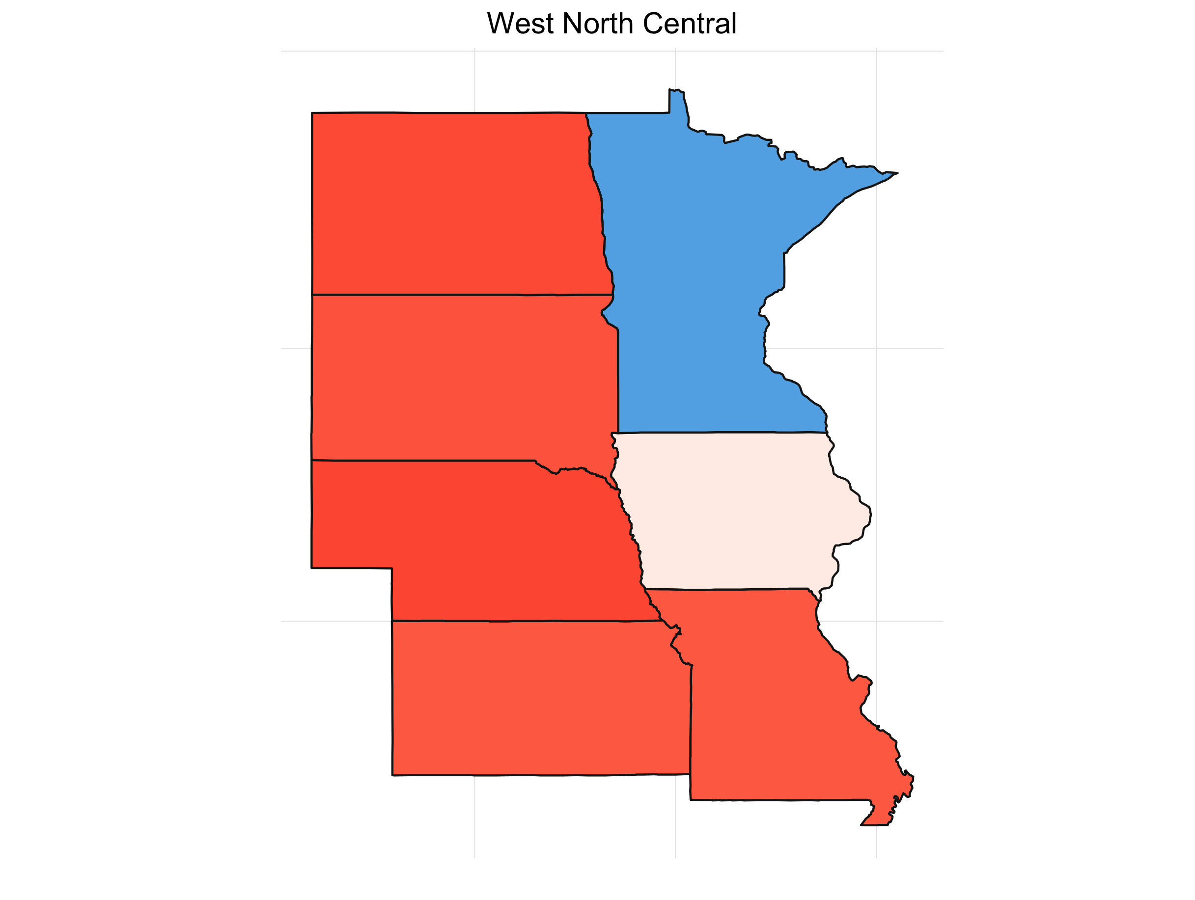
What’s always so interesting to me about the presidential election is that it’s driven by the states. It also lends itself to some great visualizations. If we look at the percent of the time a candidate wins a particular state for our simulations, we get something like this:
Click here to see the code behind these plots.
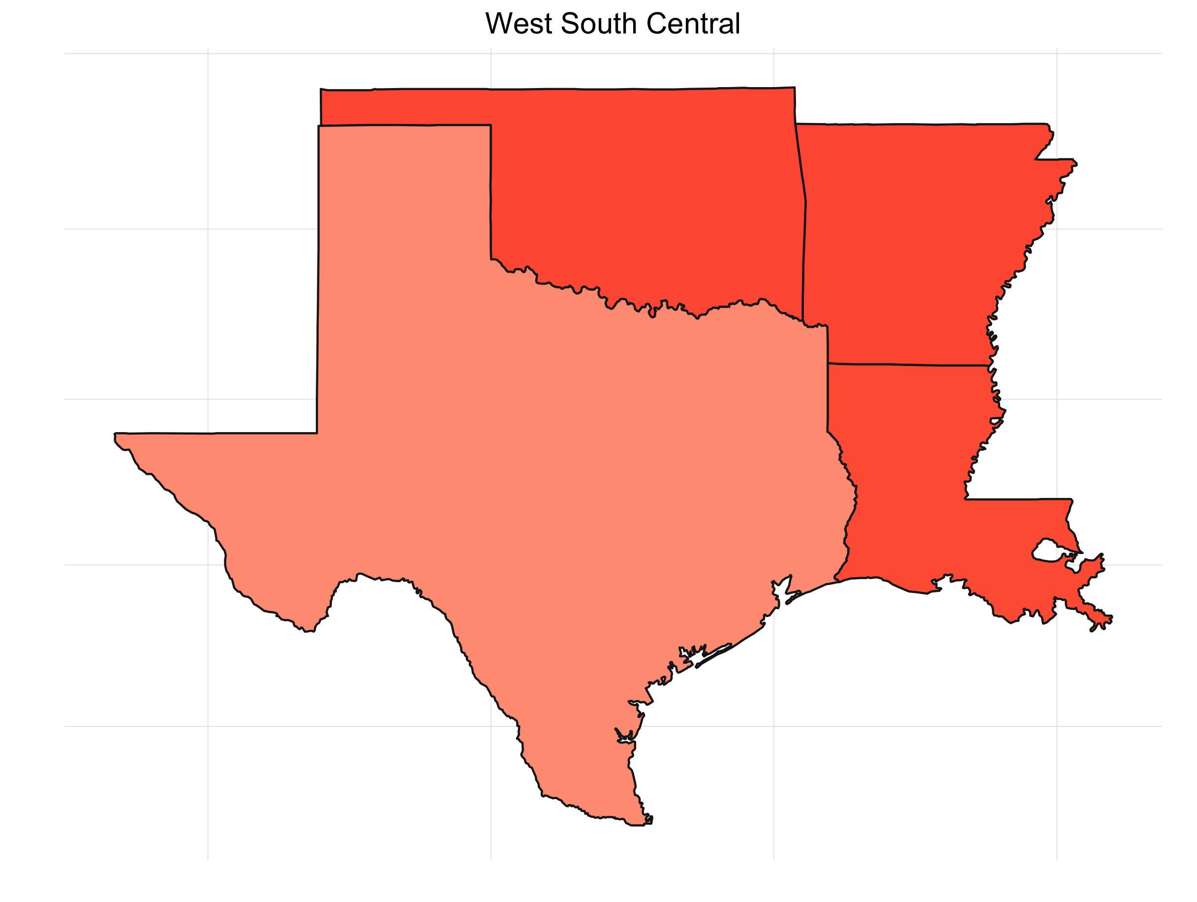
It’s interesting to see how patterns emerge. This isn’t any shocker. Political are inherently regional in the U.S. (and pretty much everywhere). Breaking down the map into sub-regions makes things a little clearer:
Final Thoughts
So there you have it! We’ll see what happens next Tuesday, but it’s always fun to speculate. If you’re interested in simulation, polling, or just the analysis of the election in general, check out these resources:
If you’re not so interested in the analysis of the election, but you do like corgis and Beyoncè, check out this Chrome extension that our very own Emily Chesler created. CorBey replaces any election posts on your facebook feed. Specifically .. with gifs of corgis or Beyonce.