
As you are going through the last analytic mile in your project to visualize and expose powerful insights to Line of Business users, you will undoubtedly need to leverage visualization libraries to display consumable and rich metrics, allowing your users to make the right decision, at the right time, within context.
As it is often said, a picture is worth a thousand words. This holds true in the analytics world. A chart is worth hours of data analysis done in advance for Line of Business users by data scientists, data engineers or power users. Picking the right visualization is just as important as any other task when it comes to dashboard creation. Developers have to pick which visualization library works best for the experience they are trying to build within their dashboards.
Not all visualization libraries are built the same
Two things are true in the current visualization world: visualization libraries are ever growing and, as with most software solutions, there is no silver bullet. You could be looking at a low level solution like D3 or a ready to use one like NVD3. You have libraries with a few ready to use visualizations like Morris.js and you have Chart.js with a richer selection at the expense of higher configuration costs. Each of these libraries behave very differently. Committing to one of them usually implies a high cost if you need to change them down the road. This may pose an issue when you figure out you need a specific visualization your library doesn’t offer.

I-See visualization 1
In our previous blog titled “Last mile of dashboard development”, we introduced the challenges of dashboard development. IBM Emerging Technologies is working on prototyping and incubating a dashboard development framework code named “I-See”. This framework, targeted at developers, is already used to drive some IBM internal Proofs of Concepts (PoCs) and is getting richer every sprint. Among many other features to speed up time to value, I-See offers developers a way to mix and match different visualization libraries into a single unit that can be plugged into the dashboard rendering flow. It removes the necessity to commit to a single library at any given point.
Rendering flow
One of I-See’s main tasks is to create visualizations. It does by following key simple steps:
- Fetch data from an endpoint. The concept of endpoints in I-See is very simple. They provide a very easy way for developers and administrators to expose simple or complex data services to end users to consume via meaningful endpoints.
- Transform data into an I-See supported format. Since not all data is provided in the same way, I-See goes through a transformation pipeline that enables developers to take control of the process. We’ll get into a more details in a future blog post.
- Invoke a renderer and pass transformed data and configuration.
Each exposes a pillar in I-See’s process: data fetching, data conversion and data visualization. Each one gets abstracted under different elements within I-See. The one that deals with visualization is called a Renderer.
Renderers: the visualization interpreters

I-See visualization 2
In I-See, a Renderer is a special element in charge of communicating between I-See’s rendering flow and the actual visualization library. Its main job is to transform the configurations that are I-See specific into ones that can be understood by the target library. By introducing these elements, I-See is able to communicate with all sorts of visualization libraries. It comes bundled with a few renderers like D3, NVD3, C3 and Morris.js. As a developer, you are not constrained to using any of those. By creating your own renderer, you teach I-See how to communicate with your favorite visualization library.
I-See renderers can be mixed and matched to create an even more powerful one, giving developers a wider range of possibilities for visualizing data. This is especially useful when a specific visualization is not provided by the main library, but by another one. If I-See renderers exists for those two libraries, then you can fully or selectively combine them to obtain a new renderer that knows how to create the visualization you are looking for, using a different library for it.
A mobile dashboard example
Performance tracking
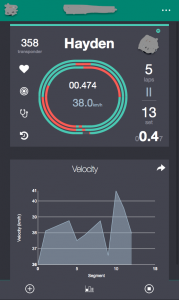
As we are socializing the I-See framework with early adopters, we created a Proof of Concept (PoC) for a sophisticated but efficient mobile dashboard for an organization training high performance athletes in Canada.
This dashboard exposes real-time, live data from athletes captured during practice and provides coaches with immediate feedback, enabling timely corrective actions. We leveraged the D3 library, customized the visuals to the sport to capture data as athletes are practicing.
This dashboard will evolve overtime, capturing more valuable data – bio-mechanical, physiological, … – via Watson IoT and a set of properly targeted sensors.
Note: organization and athlete names were anonymized to maintain data privacy.
Next steps
We are still in early development and adoption stages of this dashboard development framework. We are adding new exciting features all the time and deliver new iterations on a 2 weeks sprint cadence. To help us mature the framework and address real customer business challenges, we are now looking to get feedback from the worldwide dashboard developer community before we expose it as a “Technology preview” later this year. If your dashboard development process needs to be improved and optimized, please contact Thierry Mayeur, Senior Program Director, IBM Emerging Technologies at tmayeur@ca.ibm.com. We would love to hear from you!