
The Jupyter Notebook is an incredibly powerful tool for interactively developing and presenting data science projects. A notebook integrates code and its output into a single document that combines visualisations, narrative text, mathematical equations, and other rich media. The intuitive workflow promotes iterative and rapid development, making notebooks an increasingly popular choice at the heart of contemporary data science, analysis, and increasingly science at large. Best of all, as part of the open source Project Jupyter, they are completely free.
The Jupyter project is the successor to the earlier IPython Notebook, which was first published as a prototype in 2010. Although it is possible to use many different programming languages within Jupyter Notebooks, this article will focus on Python as it is the most common use case.
To get the most out of this tutorial you should be familiar with programming, specifically Python and pandas specifically. That said, if you have experience with another language, the Python in this article shouldn’t be too cryptic and pandas should be interpretable. Jupyter Notebooks can also act as a flexible platform for getting to grips with pandas and even Python, as it will become apparent in this article.
We will:
- Cover the basics of installing Jupyter and creating your first notebook
- Delve deeper and learn all the important terminology
- Explore how easily notebooks can be shared and published online. Indeed, this article is a Jupyter Notebook! Everything here was written in the Jupyter Notebook environment and you are viewing it in a read-only form.
Example data analysis in a Jupyter Notebook
We will walk through a sample analysis, to answer a real-life question, so you can see how the flow of a notebook makes the task intuitive to work through ourselves, as well as for others to understand when we share it with them.
So, let’s say you’re a data analyst and you’ve been tasked with finding out how the profits of the largest companies in the US changed historically. You find a data set of Fortune 500 companies spanning over 50 years since the list’s first publication in 1955, put together from Fortune’s public archive.
As we shall demonstrate, Jupyter Notebooks are perfectly suited for this investigation. First, let’s go ahead and install Jupyter.
Installation
The easiest way for a beginner to get started with Jupyter Notebooks is by installing Anaconda. Anaconda is the most widely used Python distribution for data science and comes pre-loaded with all the most popular libraries and tools. As well as Jupyter, some of the biggest Python libraries wrapped up in Anaconda include NumPy, pandas and Matplotlib, though the full 1000+ list is exhaustive. This lets you hit the ground running in your own fully stocked data science workshop without the hassle of managing countless installations or worrying about dependencies and OS-specific (read: Windows-specific) installation issues.
To get Anaconda, simply:
- Download the latest version of Anaconda for Python 3 (ignore Python 2.7).
- Install Anaconda by following the instructions on the download page and/or in the executable.
If you are a more advanced user with Python already installed and prefer to manage your packages manually, you can just use pip:
pip3 install jupyter
Creating Your First Notebook
In this section, we’re going to see how to run and save notebooks, familiarise ourselves with their structure, and understand the interface. We’ll become intimate with some core terminology that will steer you towards a practical understanding of how to use Jupyter Notebooks by yourself and set us up for the next section, which steps through an example data analysis and brings everything we learn here to life.
Running Jupyter
On Windows, you can run Jupyter via the shortcut Anaconda adds to your start menu, which will open a new tab in your default web browser that should look something like the following screenshot.
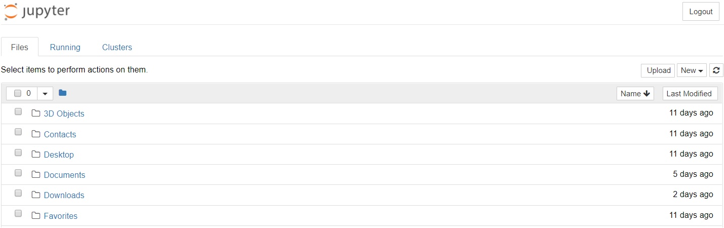
This isn’t a notebook just yet, but don’t panic! There’s not much to it. This is the Notebook Dashboard, specifically designed for managing your Jupyter Notebooks. Think of it as the launchpad for exploring, editing and creating your notebooks.
Be aware that the dashboard will give you access only to the files and sub-folders contained within Jupyter’s start-up directory; however, the start-up directory can be changed. It is also possible to start the dashboard on any system via the command prompt (or terminal on Unix systems) by entering the command jupyter notebook; in this case, the current working directory will be the start-up directory.
The astute reader may have noticed that the URL for the dashboard is something like http://localhost:8888/tree. Localhost is not a website, but indicates that the content is being served from your local machine: your own computer. Jupyter’s Notebooks and dashboard are web apps, and Jupyter starts up a local Python server to serve these apps to your web browser, making it essentially platform independent and opening the door to easier sharing on the web.
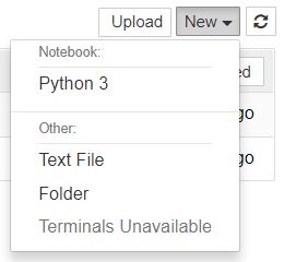
The dashboard’s interface is mostly self-explanatory — though we will come back to it briefly later. So what are we waiting for? Browse to the folder in which you would like to create your first notebook, click the “New” drop-down button in the top-right and select “Python 3” (or the version of your choice).
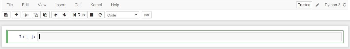
Hey presto, here we are! Your first Jupyter Notebook will open in new tab — each notebook uses its own tab because you can open multiple notebooks simultaneously. If you switch back to the dashboard, you will see the new file Untitled.ipynb and you should see some green text that tells you your notebook is running.
What is an ipynb File?
It will be useful to understand what this file really is. Each .ipynb file is a text file that describes the contents of your notebook in a format called JSON. Each cell and its contents, including image attachments that have been converted into strings of text, is listed therein along with some metadata. You can edit this yourself — if you know what you are doing! — by selecting “Edit > Edit Notebook Metadata” from the menu bar in the notebook.
You can also view the contents of your notebook files by selecting “Edit” from the controls on the dashboard, but the keyword here is “can“; there’s no reason other than curiosity to do so unless you really know what you are doing.
The notebook interface
Now that you have an open notebook in front of you, its interface will hopefully not look entirely alien; after all, Jupyter is essentially just an advanced word processor. Why not take a look around? Check out the menus to get a feel for it, especially take a few moments to scroll down the list of commands in the command palette, which is the small button with the keyboard icon (or Ctrl + Shift + P).
There are two fairly prominent terms that you should notice, which are probably new to you: cells and kernels are key both to understanding Jupyter and to what makes it more than just a word processor. Fortunately, these concepts are not difficult to understand.
- A kernel is a “computational engine” that executes the code contained in a notebook document.
- A cell is a container for text to be displayed in the notebook or code to be executed by the notebook’s kernel.
Cells
We’ll return to kernels a little later, but first let’s come to grips with cells. Cells form the body of a notebook. In the screenshot of a new notebook in the section above, that box with the green outline is an empty cell. There are two main cell types that we will cover:
- A code cell contains code to be executed in the kernel and displays its output below.
- A Markdown cell contains text formatted using Markdown and displays its output in-place when it is run.
The first cell in a new notebook is always a code cell. Let’s test it out with a classic hello world example. Type print('Hello World!') into the cell and click the run button  in the toolbar above or press
 Ctrl + Enter. The result should look like this:
print('Hello World!')
Hello World!
When you ran the cell, its output will have been displayed below and the label to its left will have changed from In [ ] to In [1]. The output of a code cell also forms part of the document, which is why you can see it in this article. You can always tell the difference between code and Markdown cells because code cells have that label on the left and Markdown cells do not. The “In” part of the label is simply short for “Input,” while the label number indicates when the cell was executed on the kernel — in this case the cell was executed first. Run the cell again and the label will change to In [2] because now the cell was the second to be run on the kernel. It will become clearer why this is so useful later on when we take a closer look at kernels.
From the menu bar, click Insert and select Insert Cell Below to create a new code cell underneath your first and try out the following code to see what happens. Do you notice anything different?
import time
time.sleep(3)
This cell doesn’t produce any output, but it does take three seconds to execute. Notice how Jupyter signifies that the cell is currently running by changing its label to In [*].
In general, the output of a cell comes from any text data specifically printed during the cells execution, as well as the value of the last line in the cell, be it a lone variable, a function call, or something else. For example:
def say_hello(recipient):
    return 'Hello, {}!'.format(recipient)

say_hello('Tim')
'Hello, Tim!'
You’ll find yourself using this almost constantly in your own projects, and we’ll see more of it later on.
Keyboard shortcuts
One final thing you may have observed when running your cells is that their border turned blue, whereas it was green while you were editing. There is always one “active” cell highlighted with a border whose colour denotes its current mode, where green means “edit mode” and blue is “command mode.”
So far we have seen how to run a cell with Ctrl + Enter, but there are plenty more. Keyboard shortcuts are a very popular aspect of the Jupyter environment because they facilitate a speedy cell-based workflow. Many of these are actions you can carry out on the active cell when it’s in command mode.
Below, you’ll find a list of some of Jupyter’s keyboard shortcuts. You’re not expected to pick them up immediately, but the list should give you a good idea of what’s possible.
- Toggle between edit and command mode with
EscandEnter, respectively. - Once in command mode:
- Scroll up and down your cells with your
UpandDownkeys. - Press
AorBto insert a new cell above or below the active cell. Mwill transform the active cell to a Markdown cell.Ywill set the active cell to a code cell.D + D(Dtwice) will delete the active cell.Zwill undo cell deletion.- Hold
Shiftand pressUporDownto select multiple cells at once.- With multple cells selected,
Shift + Mwill merge your selection.
- With multple cells selected,
- Scroll up and down your cells with your
Ctrl + Shift + -, in edit mode, will split the active cell at the cursor.- You can also click and
Shift + Clickin the margin to the left of your cells to select them.
Go ahead and try these out in your own notebook. Once you’ve had a play, create a new Markdown cell and we’ll learn how to format the text in our notebooks.
Markdown
Markdown is a lightweight, easy to learn markup language for formatting plain text. Its syntax has a one-to-one correspondance with HTML tags, so some prior knowledge here would be helpful but is definitely not a prerequisite. Remember that this article was written in a Jupyter notebook, so all of the narrative text and images you have seen so far was achieved in Markdown. Let’s cover the basics with a quick example.
# This is a level 1 heading
## This is a level 2 heading
This is some plain text that forms a paragraph.
Add emphasis via **bold** and __bold__, or *italic* and _italic_.
Paragraphs must be separated by an empty line.
* Sometimes we want to include lists.
* Which can be indented.
1. Lists can also be numbered.
2. For ordered lists.
[It is possible to include hyperlinks](https://www.example.com)
Inline code uses single backticks: `foo()`, and code blocks use triple backticks:
```
bar()
```
Or can be intented by 4 spaces:
foo()
And finally, adding images is easy: 
When attaching images, you have three options:
- Use a URL to an image on the web.
- Use a local URL to an image that you will be keeping alongside your notebook, such as in the same git repo.
- Add an attachment via “Edit > Insert Image”; this will convert the image into a string and store it inside your notebook
.ipynbfile.
- Note that this will make your
.ipynbfile much larger!
There is plenty more detail to Markdown, especially around hyperlinking, and it’s also possible to simply include plain HTML. Once you find yourself pushing the limits of the basics above, you can refer to the official guide from the creator, John Gruber, on his website.
Kernels
Behind every notebook runs a kernel. When you run a code cell, that code is executed within the kernel and any output is returned back to the cell to be displayed. The kernel’s state persists over time and between cells — it pertains to the document as a whole and not individual cells.
For example, if you import libraries or declare variables in one cell, they will be available in another. In this way, you can think of a notebook document as being somewhat comparable to a script file, except that it is multimedia. Let’s try this out to get a feel for it. First, we’ll import a Python package and define a function.
import numpy as np

def square(x):
    return x * x
Once we’ve executed the cell above, we can reference np and square in any other cell.
x = np.random.randint(1, 10)
y = square(x)

print('%d squared is %d' % (x, y))
1 squared is 1
This will work regardless of the order of the cells in your notebook. You can try it yourself, let’s print out our variables again.
print('Is %d squared is %d?' % (x, y))
Is 1 squared is 1?
No surprises here! But now let’s change y.
y = 10
What do you think will happen if we run the cell containing our print statement again? We will get the output Is 4 squared is 10?!
Most of the time, the flow in your notebook will be top-to-bottom, but it’s common to go back to make changes. In this case, the order of execution stated to the left of each cell, such as In [6], will let you know whether any of your cells have stale output. And if you ever wish to reset things, there are several incredibly useful options from the Kernel menu:
- Restart: restarts the kernel, thus clearing all the variables etc that were defined.
- Restart & Clear Output: same as above but will also wipe the output displayed below your code cells.
- Restart & Run All: same as above but will also run all your cells in order from first to last.
If your kernel is ever stuck on a computation and you wish to stop it, you can choose the Interupt option.
Choosing a kernal
You may have noticed that Jupyter gives you the option to change kernel, and in fact there are many different options to choose from. Back when you created a new notebook from the dashboard by selecting a Python version, you were actually choosing which kernel to use.
Not only are there kernels for different versions of Python, but also for over 100 languages including Java, C, and even Fortran. Data scientists may be particularly interested in the kernels for R and Julia, as well as both imatlab and the Calysto MATLAB Kernel for Matlab. The SoS kernel provides multi-language support within a single notebook. Each kernel has its own installation instructions, but will likely require you to run some commands on your computer.
Example analysis
Now we’ve looked at what a Jupyter Notebook is, it’s time to look at how they’re used in practice, which should give you a clearer understanding of why they are so popular. It’s finally time to get started with that Fortune 500 data set mentioned earlier. Remember, our goal is to find out how the profits of the largest companies in the US changed historically.
It’s worth noting that everyone will develop their own preferences and style, but the general principles still apply, and you can follow along with this section in your own notebook if you wish, which gives you the scope to play around.
Naming your notebooks
Before you start writing your project, you’ll probably want to give it a meaningful name. Perhaps somewhat confusingly, you cannot name or rename your notebooks from the notebook app itself, but must use either the dashboard or your file browser to rename the .ipynb file. We’ll head back to the dashboard to rename the file you created earlier, which will have the default notebook file name Untitled.ipynb.
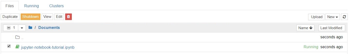
You cannot rename a notebook while it is running, so you’ve first got to shut it down. The easiest way to do this is to select “File > Close and Halt” from the notebook menu. However, you can also shutdown the kernel either by going to “Kernel > Shutdown” from within the notebook app or by selecting the notebook in the dashboard and clicking “Shutdown” (see image below).
You can then select your notebook and and click “Rename” in the dashboard controls.
Note that closing the notebook tab in your browser will not “close” your notebook in the way closing a document in a traditional application will. The notebook’s kernel will continue to run in the background and needs to be shut down before it is truly “closed” — though this is pretty handy if you accidentally close your tab or browser! If the kernel is shut down, you can close the tab without worrying about whether it is still running or not.
Once you’ve named your notebook, open it back up and we’ll get going.
Setup
It’s common to start off with a code cell specifically for imports and setup, so that if you choose to add or change anything, you can simply edit and re-run the cell without causing any side-effects.
%matplotlib inline

import pandas as pd
import matplotlib.pyplot as plt
import seaborn as sns

sns.set(style="darkgrid")
We import pandas to work with our data, Matplotlib to plot charts, and Seaborn to make our charts prettier. It’s also common to import NumPy but in this case, although we use it via pandas, we don’t need to explicitly. And that first line isn’t a Python command, but uses something called a line magic to instruct Jupyter to capture Matplotlib plots and render them in the cell output; this is one of a range of advanced features that are out of the scope of this article.
Let’s go ahead and load our data.
df = pd.read_csv('fortune500.csv')
It’s sensible to also do this in a single cell in case we need to reload it at any point.
Save and Checkpoint
Now we’ve got started, it’s best practice to save regularly. Pressing Ctrl + S will save your notebook by calling the “Save and Checkpoint” command, but what this checkpoint thing?
Every time you create a new notebook, a checkpoint file is created as well as your notebook file; it will be located within a hidden subdirectory of your save location called .ipynb_checkpoints and is also a .ipynb file. By default, Jupyter will autosave your notebook every 120 seconds to this checkpoint file without altering your primary notebook file. When you “Save and Checkpoint,” both the notebook and checkpoint files are updated. Hence, the checkpoint enables you to recover your unsaved work in the event of an unexpected issue. You can revert to the checkpoint from the menu via “File > Revert to Checkpoint.”
Investigating our data set
Now we’re really rolling! Our notebook is safely saved and we’ve loaded our data set df into the most-used pandas data structure, which is called a DataFrame and basically looks like a table. What does ours look like?
df.head()
| Year | Rank | Company | Revenue (in millions) | Profit (in millions) | |
|---|---|---|---|---|---|
| 0 | 1955 | 1 | General Motors | 9823.5 | 806 |
| 1 | 1955 | 2 | Exxon Mobil | 5661.4 | 584.8 |
| 2 | 1955 | 3 | U.S. Steel | 3250.4 | 195.4 |
| 3 | 1955 | 4 | General Electric | 2959.1 | 212.6 |
| 4 | 1955 | 5 | Esmark | 2510.8 | 19.1 |
df.tail()
| Year | Rank | Company | Revenue (in millions) | Profit (in millions) | |
|---|---|---|---|---|---|
| 25495 | 2005 | 496 | Wm. Wrigley Jr. | 3648.6 | 493 |
| 25496 | 2005 | 497 | Peabody Energy | 3631.6 | 175.4 |
| 25497 | 2005 | 498 | Wendy’s International | 3630.4 | 57.8 |
| 25498 | 2005 | 499 | Kindred Healthcare | 3616.6 | 70.6 |
| 25499 | 2005 | 500 | Cincinnati Financial | 3614.0 | 584 |
Looking good. We have the columns we need, and each row corresponds to a single company in a single year.
Let’s just rename those columns so we can refer to them later.
df.columns = ['year', 'rank', 'company', 'revenue', 'profit']
Next, we need to explore our data set. Is it complete? Did pandas read it as expected? Are any values missing?
len(df)
25500
Okay, that looks good — that’s 500 rows for every year from 1955 to 2005, inclusive.
Let’s check whether our data set has been imported as we would expect. A simple check is to see if the data types (or dtypes) have been correctly interpreted.
df.dtypes
year         int64
rank         int64
company     object
revenue    float64
profit      object
dtype: object
Uh oh. It looks like there’s something wrong with the profits column — we would expect it to be a float64 like the revenue column. This indicates that it probably contains some non-integer values, so let’s take a look.
non_numberic_profits = df.profit.str.contains('[^0-9.-]')
df.loc[non_numberic_profits].head()
| year | rank | company | revenue | profit | |
|---|---|---|---|---|---|
| 228 | 1955 | 229 | Norton | 135.0 | N.A. |
| 290 | 1955 | 291 | Schlitz Brewing | 100.0 | N.A. |
| 294 | 1955 | 295 | Pacific Vegetable Oil | 97.9 | N.A. |
| 296 | 1955 | 297 | Liebmann Breweries | 96.0 | N.A. |
| 352 | 1955 | 353 | Minneapolis-Moline | 77.4 | N.A. |
Just as we suspected! Some of the values are strings, which have been used to indicate missing data. Are there any other values that have crept in?
set(df.profit[non_numberic_profits])
{'N.A.'}
That makes it easy to interpret, but what should we do? Well, that depends how many values are missing.
len(df.profit[non_numberic_profits])
369
It’s a small fraction of our data set, though not completely inconsequential as it is still around 1.5%. If rows containing N.A. are, roughly, uniformly distributed over the years, the easiest solution would just be to remove them. So let’s have a quick look at the distribution.
bin_sizes, _, _ = plt.hist(df.year[non_numberic_profits], bins=range(1955, 2006))
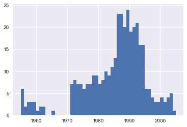
At a glance, we can see that the most invalid values in a single year is fewer than 25, and as there are 500 data points per year, removing these values would account for less than 4% of the data for the worst years. Indeed, other than a surge around the 90s, most years have fewer than half the missing values of the peak. For our purposes, let’s say this is acceptable and go ahead and remove these rows.
df = df.loc[~non_numberic_profits]
df.profit = df.profit.apply(pd.to_numeric)
We should check that worked.
len(df)
25131
df.dtypes
year         int64
rank         int64
company     object
revenue    float64
profit     float64
dtype: object
Great! We have finished our data set setup.
If you were going to present your notebook as a report, you could get rid of the investigatory cells we created, which are included here as a demonstration of the flow of working with notebooks, and merge relevant cells (see the Advanced Functionality section below for more on this) to create a single data set setup cell. This would mean that if we ever mess up our data set elsewhere, we can just rerun the setup cell to restore it.
Plotting with matplotlib
Next, we can get to addressing the question at hand by plotting the average profit by year. We might as well plot the revenue as well, so first we can define some variables and a method to reduce our code.
group_by_year = df.loc[:, ['year', 'revenue', 'profit']].groupby('year')
avgs = group_by_year.mean()
x = avgs.index
y1 = avgs.profit

def plot(x, y, ax, title, y_label):
    ax.set_title(title)
    ax.set_ylabel(y_label)
    ax.plot(x, y)
    ax.margins(x=0, y=0)
Now let’s plot!
fig, ax = plt.subplots()
plot(x, y1, ax, 'Increase in mean Fortune 500 company profits from 1955 to 2005', 'Profit (millions)')
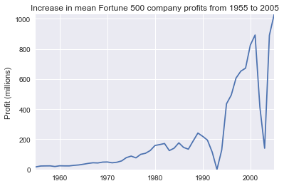
Wow, that looks like an exponential, but it’s got some huge dips. They must correspond to the early 1990s recession and the dot-com bubble. It’s pretty interesting to see that in the data. But how come profits recovered to even higher levels post each recession?
Maybe the revenues can tell us more.
y2 = avgs.revenue
fig, ax = plt.subplots()
plot(x, y2, ax, 'Increase in mean Fortune 500 company revenues from 1955 to 2005', 'Revenue (millions)')
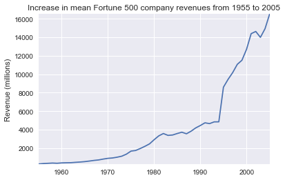
That adds another side to the story. Revenues were no way nearly as badly hit, that’s some great accounting work from the finance departments.
With a little help from Stack Overflow, we can superimpose these plots with +/- their standard deviations.
def plot_with_std(x, y, stds, ax, title, y_label):
    ax.fill_between(x, y - stds, y + stds, alpha=0.2)
    plot(x, y, ax, title, y_label)

fig, (ax1, ax2) = plt.subplots(ncols=2)
title = 'Increase in mean and std Fortune 500 company %s from 1955 to 2005'
stds1 = group_by_year.std().profit.as_matrix()
stds2 = group_by_year.std().revenue.as_matrix()
plot_with_std(x, y1.as_matrix(), stds1, ax1, title % 'profits', 'Profit (millions)')
plot_with_std(x, y2.as_matrix(), stds2, ax2, title % 'revenues', 'Revenue (millions)')
fig.set_size_inches(14, 4)
fig.tight_layout()
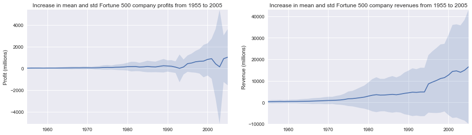
That’s staggering, the standard deviations are huge. Some Fortune 500 companies make billions while others lose billions, and the risk has increased along with rising profits over the years. Perhaps some companies perform better than others; are the profits of the top 10% more or less volatile than the bottom 10%?
There are plenty of questions that we could look into next, and it’s easy to see how the flow of working in a notebook matches one’s own thought process, so now it’s time to draw this example to a close. This flow helped us to easily investigate our data set in one place without context switching between applications, and our work is immediately sharable and reproducible. If we wished to create a more concise report for a particular audience, we could quickly refactor our work by merging cells and removing intermediary code.
Sharing your notebooks
When people talk of sharing their notebooks, there are generally two paradigms they may be considering. Most often, individuals share the end-result of their work, much like this article itself, which means sharing non-interactive, pre-rendered versions of their notebooks; however, it is also possible to collaborate on notebooks with the aid version control systems such as Git.
That said, there are some nascent companies popping up on the web offering the ability to run interactive Jupyter Notebooks in the cloud.
Before you share
A shared notebook will appear exactly in the state it was in when you export or save it, including the output of any code cells. Therefore, to ensure that your notebook is share-ready, so to speak, there are a few steps you should take before sharing:
- Click “Cell > All Output > Clear”
- Click “Kernel > Restart & Run All”
- Wait for your code cells to finish executing and check they did so as expected
This will ensure your notebooks don’t contain intermediary output, have a stale state, and executed in order at the time of sharing.
Exporting your notebooks
Jupyter has built-in support for exporting to HTML and PDF as well as several other formats, which you can find from the menu under “File > Download As.” If you wish to share your notebooks with a small private group, this functionality may well be all you need. Indeed, as many researchers in academic institutions are given some public or internal webspace, and because you can export a notebook to an HTML file, Jupyter Notebooks can be an especially convenient way for them to share their results with their peers.
But if sharing exported files doesn’t cut it for you, there are also some immensely popular methods of sharing .ipynb files more directly on the web.
GitHub
With the number of public notebooks on GitHub exceeding 1.8 million by early 2018, it is surely the most popular independent platform for sharing Jupyter projects with the world. GitHub has integrated support for rendering .ipynb files directly both in repositories and gists on its website. If you aren’t already aware, GitHub is a code hosting platform for version control and collaboration for repositories created with Git. You’ll need an account to use their services, but standard accounts are free.
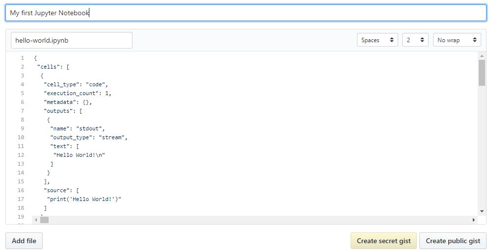
Once you have a GitHub account, the easiest way to share a notebook on GitHub doesn’t actually require Git at all. Since 2008, GitHub has provided its Gist service for hosting and sharing code snippets, which each get their own repository. To share a notebook using Gists:
- Sign in and browse to gist.github.com.
- Open your
.ipynbfile in a text editor, select all and copy the JSON inside. - Paste the notebook JSON into the gist.
- Give your Gist a filename, remembering to add
.iypnbor this will not work. - Click either “Create secret gist” or “Create public gist.”
This should look something like the following:
If you created a public Gist, you will now be able to share its URL with anyone, and others will be able to fork and clone your work.
Creating your own Git repository and sharing this on GitHub is beyond the scope of this tutorial, but GitHub provides plenty of guides for you to get started on your own.
An extra tip for those using git is to add an exception to your .gitignore for those hidden .ipynb_checkpoints directories Jupyter creates, so as not to commit checkpoint files unnecessarily to your repo.
Nbviewer
Having grown to render hundreds of thousands of notebooks every week by 2015, NBViewer is the most popular notebook renderer on the web. If you already have somewhere to host your Jupyter Notebooks online, be it GitHub or elsewhere, NBViewer will render your notebook and provide a shareable URL along with it. Provided as a free service as part of Project Jupyter, it is available at nbviewer.jupyter.org.
Initially developed before GitHub’s Jupyter Notebook integration, NBViewer allows anyone to enter a URL, Gist ID, or GitHub username/repo/file and it will render the notebook as a webpage. A Gist’s ID is the unique number at the end of its URL; for example, the string of characters after the last backslash in https://gist.github.com/username/50896401c23e0bf417e89cd57e89e1de. If you enter a GitHub username or username/repo, you will see a minimal file browser that lets you explore a user’s repos and their contents.
The URL NBViewer displays when displaying a notebook is a constant based on the URL of the notebook it is rendering, so you can share this with anyone and it will work as long as the original files remain online — NBViewer doesn’t cache files for very long.
Final Thoughts
Starting with the basics, we have come to grips with the natural workflow of Jupyter Notebooks, delved into IPython’s more advanced features, and finally learned how to share our work with friends, colleagues, and the world. And we accomplished all this from a notebook itself!
It should be clear how notebooks promote a productive working experience by reducing context switching and emulating a natural development of thoughts during a project. The power of Jupyter Notebooks should also be evident, and we covered plenty of leads to get you started exploring more advanced features in your own projects.
If you’d like further inspiration for your own Notebooks, Jupyter has put together a gallery of interesting Jupyter Notebooks that you may find helpful and the Nbviewer homepage links to some really fancy examples of quality notebooks. Also check out our list of Jupyter Notebook tips.
Want to learn more about Jupyter Notebooks? We have a guided project you may be interested in.